Best AI Image Generators in 2026: Tested and Ranked
We give every major AI image generator the same three prompts, keep the first image and rank the results on photorealism, on-screen text and product advertising. The ranking is updated as new models arrive.

Search for the best AI image generators and you'll find the same names every time, from GPT Image and Nano Banana to Midjourney, Ideogram, Reve and Seedream, and almost no proof of what happened when somebody typed a prompt and downloaded the first result. Most of what gets called testing is a few unrelated images and the brands' own feature pages, rewritten in tidy sentences about "strong typographic fidelity" and "high semantic prompt adherence".
We wanted normal explanations. A face looks real because the pores, peach fuzz and catchlights still hold up at full size, a hospital screen looks bad because the small words turn into symbols from some ancient civilisation when you zoom in, and a perfume bottle nearly half the height of the man beside it has a scale problem, however good the lighting is. So thirteen models, including OpenAI's new GPT Image 2.5 Flare and Sunburst and Google's Nano Banana 2.1, got the same three jobs: a close-up face, a doctor at a monitor showing exact patient data, and a fragrance advert for a brand that doesn't exist. We kept the first image each one produced, mistakes included.
Quick answer
| Test | Winner | Why it won |
|---|---|---|
| Photorealism | GPT Image 2.5 Sunburst | The least retouched face in the test, with open pores, fine under-eye creases, irregular freckles and faint veins in the whites of the eyes |
| Hospital screen | Seedream 5.0 Pro | The most convincing workstation photograph, with every requested element on screen and lighting that matches the room |
| VAREN 92 advert | GPT Image 2.5 Flare | The most believable campaign photograph, with both hands, side light, real smoked glass and the most reasonable bottle size of the images that followed the brief |
Across all three tests, GPT Image 2.5 Flare and Sunburst share first place. Each won one test and came second in another, and they shared fifth in the hospital, so they finished on exactly the same total. If realistic people are what you need, take Sunburst; if the job is a product in a scene, Flare made the better campaign photograph.
The full ranking
| Rank | Model | Face | Hospital | Advert | Total |
|---|---|---|---|---|---|
| =1 | GPT Image 2.5 Flare | 2 | 5.5 | 1 | 8.5 |
| =1 | GPT Image 2.5 Sunburst | 1 | 5.5 | 2 | 8.5 |
| 3 | Midjourney 8.2 | 4 | 3 | 6 | 13 |
| 4 | GPT Image 2 | 3 | 7 | 4 | 14 |
| 5 | Ideogram 4.0 | 5 | 2 | 9 | 16 |
| 6 | Seedream 5.0 Pro | 10 | 1 | 8 | 19 |
| 7 | Reve 2.1 | 11 | 4 | 7 | 22 |
| 8 | Nano Banana 2.1 | 7 | 9 | 11 | 27 |
| =9 | Nano Banana Pro | 8 | 8 | 12 | 28 |
| =9 | MAI-Image 2.6 Preview | 12 | 13 | 3 | 28 |
| =9 | Meta Muse Image | 6 | 12 | 10 | 28 |
| 12 | Grok Imagine Image 2.0 | 13 | 11 | 5 | 29 |
| 13 | Nano Banana 2 | 9 | 10 | 13 | 32 |
How we got to these numbers
Every model got a place from 1 to 13 in each test, and the three places add up to its total, so lower is better. Those places came from putting the full-size originals side by side and zooming into whatever decides that test: skin and eyes in the portrait, the monitor in the hospital, the bottle, hands and proportions in the advert. Where two models were too close to call, they share the places, which is why Flare and Sunburst both carry 5.5 for the hospital.
Read the totals as our editorial calls added together rather than a measurement of image quality. Flare and Sunburst finish level, for example, and a single placement in a single test would have split them.
Ignoring the brief cost a model more than failing our taste did, whether that meant a wrong number on the patient screen, a logo we banned or a hand in a pocket after we asked for both hands. A flawless but fake-looking image could still finish below a convincing photograph with one slip, and the test sections point out where that happened.
Adding the tests up also stops one great image from carrying a model. MAI made the third-best advert in the test and finished joint ninth, because the hospital scene never arrived.
How we tested
Some comparison pages are worth reading; our favorite Arena's text-to-image tables show which models people vote for, and they often matched what we saw. Basic NPC-style roundups like Zapier's are easy to scan, but they mostly read like neat summaries of the guides the brands already publish. We picked our models from search results, Reddit and Discord discussions, Arena and our own work, and followed our TGK Tests & Research standard: show what we tried, what happened, what it cost and where it failed.
Our "highly complicated TGK testing protocol" was simple. Every model received the same brief for each test, reformatted only where an interface handled sections or shorter prompts better. We used the highest practical native quality, 4:5 where it was offered and the closest portrait ratio where it wasn't, and judged the first output with no editing, upscaling or rerolling. A reroll might have produced something better, but we wanted to see how much each model understood before anyone started fixing things.
Thirteen models and three prompts make 39 combinations, and 38 produced an image we could judge. MAI-Image 2.6 never returned the hospital scene in roughly ten attempts. Ideogram's hospital result is a second attempt, because the first stood the monitor upright after it read the word "vertical" in the prompt; we removed the word, reran it and show both. Midjourney returns four images per prompt, and we always judged the first.
| Model | Tested | Access route | Settings recorded | Cost recorded |
|---|---|---|---|---|
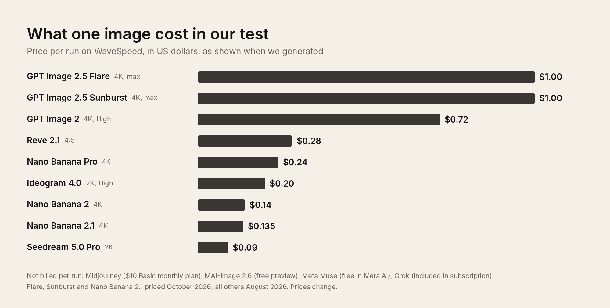
| GPT Image 2.5 Flare | October 2026 | WaveSpeed | 4K, max quality; 2576 × 3216 PNG output | $1.00 per run |
| GPT Image 2.5 Sunburst | October 2026 | WaveSpeed | 4:5, 4K, max quality; 2576 × 3216 PNG output | $1.00 per run |
| Nano Banana 2.1 | October 2026 | WaveSpeed | 4:5, 4K; Web Search and Image Search off; 3712 × 4608 PNG output | $0.135 per run |
| GPT Image 2 | August 2026 | WaveSpeed | 4K, High, PNG | $0.72 per run |
| Midjourney 8.2 | August 2026 | Midjourney website | V8.2, Raw, HD; first image of four | $10 Basic monthly plan |
| Seedream 5.0 Pro | August 2026 | WaveSpeed | 2K, JPEG | $0.09 per run |
| Ideogram 4.0 | August 2026 | WaveSpeed | 2K, High, JPEG | $0.20 per run |
| Reve 2.1 | August 2026 | WaveSpeed | 4:5, JPEG; no resolution control shown | $0.28 per run |
| MAI-Image 2.6 Preview | August 2026 | MAI Playground | Highest option available | Free during the limited preview |
| Meta Muse Image | August 2026 | Meta AI | No manual quality control | Free during the test |
| Grok Imagine Image 2.0 | August 2026 | Grok | Quality mode | Included in the subscription used |
| Nano Banana Pro | August 2026 | WaveSpeed | 4K, PNG | $0.24 per run |
| Nano Banana 2 | August 2026 | WaveSpeed | 4K, PNG; Web Search and Image Search off | $0.14 per run |
Prices are what the interface showed or what we paid at the time, and they change. Per-run fees, GPU-time plans and bundled subscriptions don't compare neatly, but the spread is still worth noticing. Flare and Sunburst cost $1.00 each at 4K on the max quality tier, the most expensive runs in the test and eleven times what Seedream cost to win the hospital round. Nano Banana 2.1 came in at $0.135, a fraction under the $0.14 Nano Banana 2 cost in August, for noticeably better images.
Every prompt, setting, cost and failure from both rounds of testing, August and October, is in the TGK AI Image Generators 2026 dataset on Hugging Face, and every original image sits in the galleries under each test. None of it shows the best image a model is capable of making; what it shows is what you get from an ordinary request on the first try, which is how most people actually use these tools.
OpenAI released ChatGPT Images 2.5 on 8 September 2026 with two API models: Flare, which it recommends for everyday work, and Sunburst, the slower one aimed at precision. Nano Banana 2.1 is Google's update to Nano Banana 2, its Flash-tier model, so it isn't a new version of Nano Banana Pro.
Test 1: Close-up facial detail and photorealism
The brief was a front-facing studio portrait of a 27-year-old woman with light olive skin, green-hazel eyes, a few freckles and tied-back dark-blonde hair, plus visible pores, peach fuzz, under-eye detail, individual eyebrow hairs and no retouching. Any model can draw a face now, so we wanted to see which one still looked like a photograph when the face filled the frame and there was nowhere to hide plastic skin or a fake hairline. Every model also has its own idea of an attractive woman, even the three Nano Banana versions, but we scored realism, not who made the prettiest person.
Sunburst won, and it wasn't the face we liked looking at most. Its whole image has a grey, slightly faded grade, as if someone pulled the saturation down, and Flare's warmer portrait is more flattering. Zoom in, though, and Sunburst is the better photograph: the pores are open across the nose and cheeks, the skin under the eyes creases like real skin, the freckles are uneven, the eyebrow hairs are separate, the light picks out the structure of the hair, and there are faint veins in the whites of the eyes.
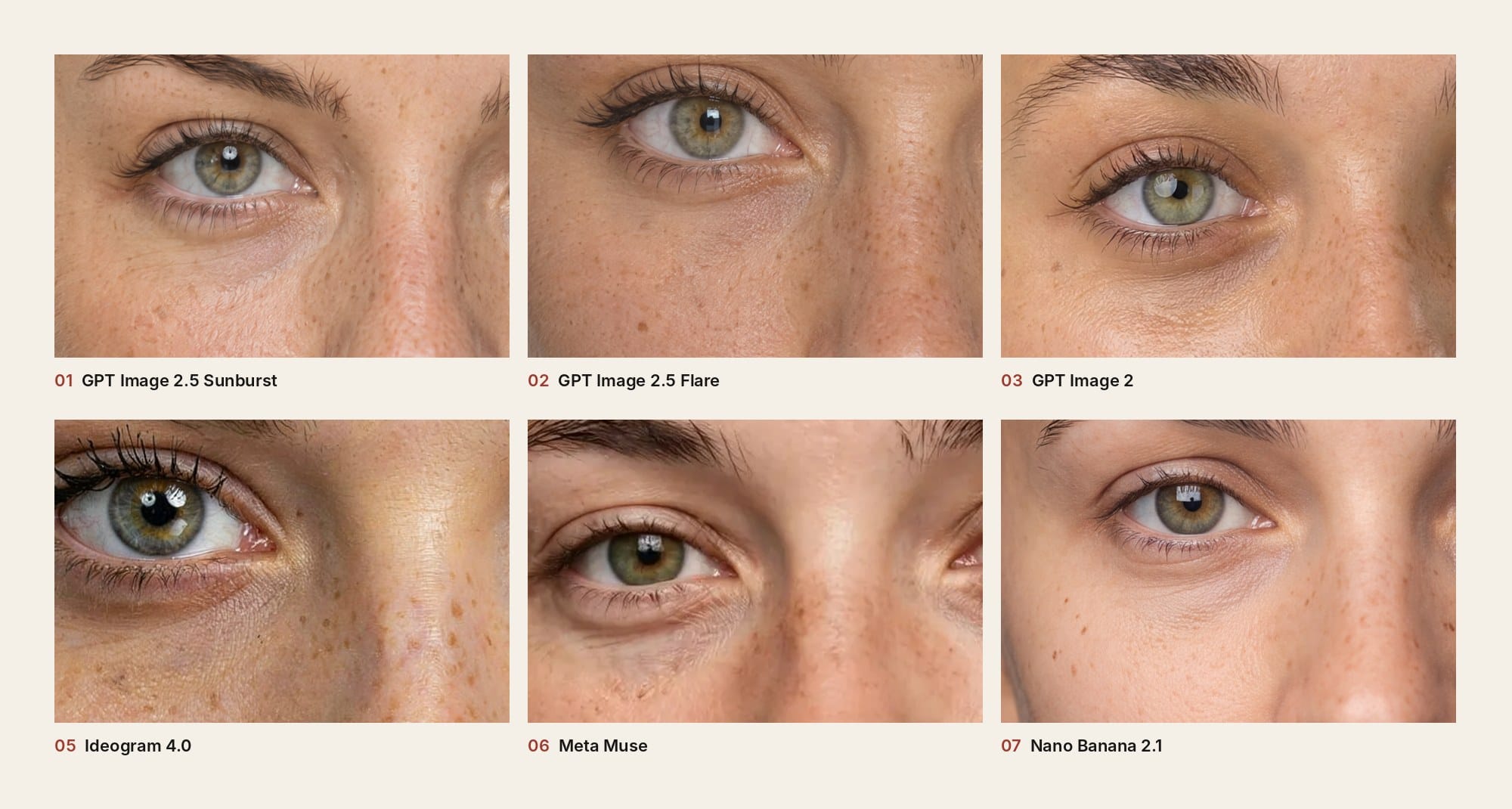
Flare is the faster of OpenAI's two models, and we went in expecting less. Its portrait has individual hair strands, visible pores, convincing eyes and even properly drawn ears, and you only notice the smoother under-eye skin and the missing small flaws when Sunburst is sitting next to it. GPT Image 2 from August takes third with great eyebrows, lashes and irises, and cheeks that are visibly smoother than either 2.5 result.
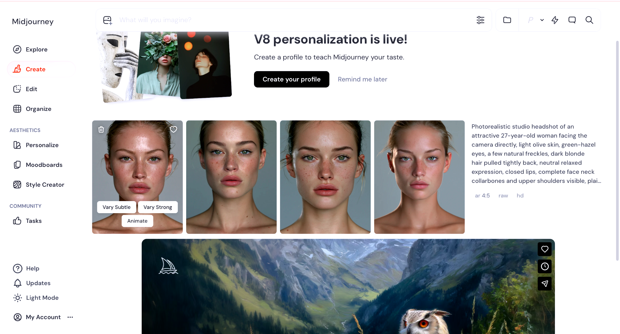
Midjourney 8.2 went its own way with a wet, oily sheen and noticeably bigger lips, which makes a striking editorial beauty shot and not the neutral studio headshot we asked for. Ideogram 4.0 has some of the best eyes in the test and real skin texture under a coat of heavy mascara, despite a prompt that banned dramatic makeup. And then there's Meta Muse, a free consumer tool working at 1408 × 1760, with pores, peach fuzz and fine upper-lip hair convincing enough to beat every Nano Banana.
Google's three models come next, in generation order. Nano Banana 2.1 has the largest file in the test at 3712 × 4608, and although the skin is still on the smooth side, its face is cleaner and more convincing than Nano Banana Pro's, which in turn edges Nano Banana 2. All three beat Seedream 5.0 Pro, whose portrait has the usual Seedream glow, that beauty-filter finish with a faintly CGI edge, even if the cheek does show real pores and uneven redness up close.
Reve 2.1 has good eyes, glowing skin and black hair, which would be fine if we hadn't asked for dark blonde. MAI's face was generic, and Grok smothered the skin in an obvious applied grain.
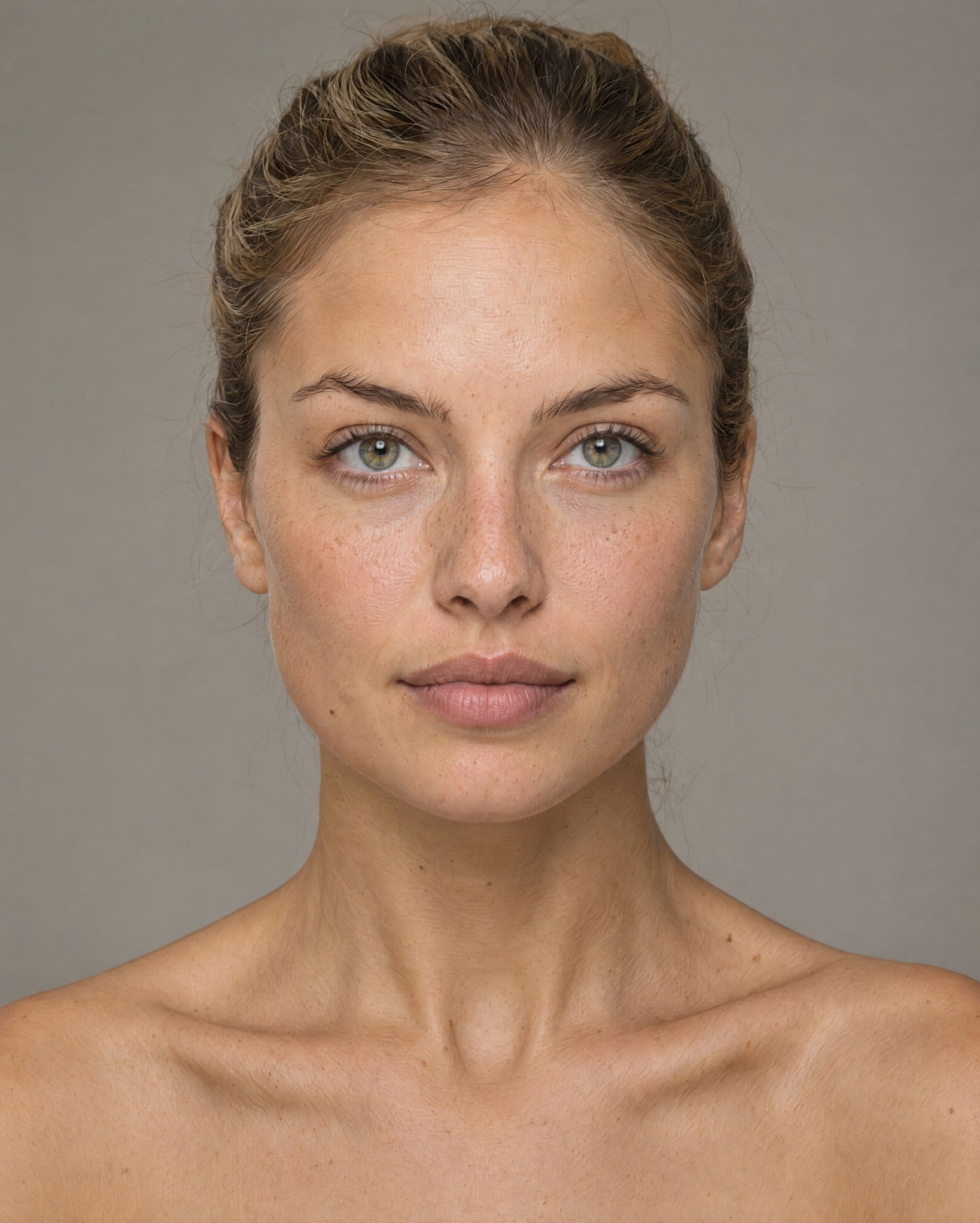
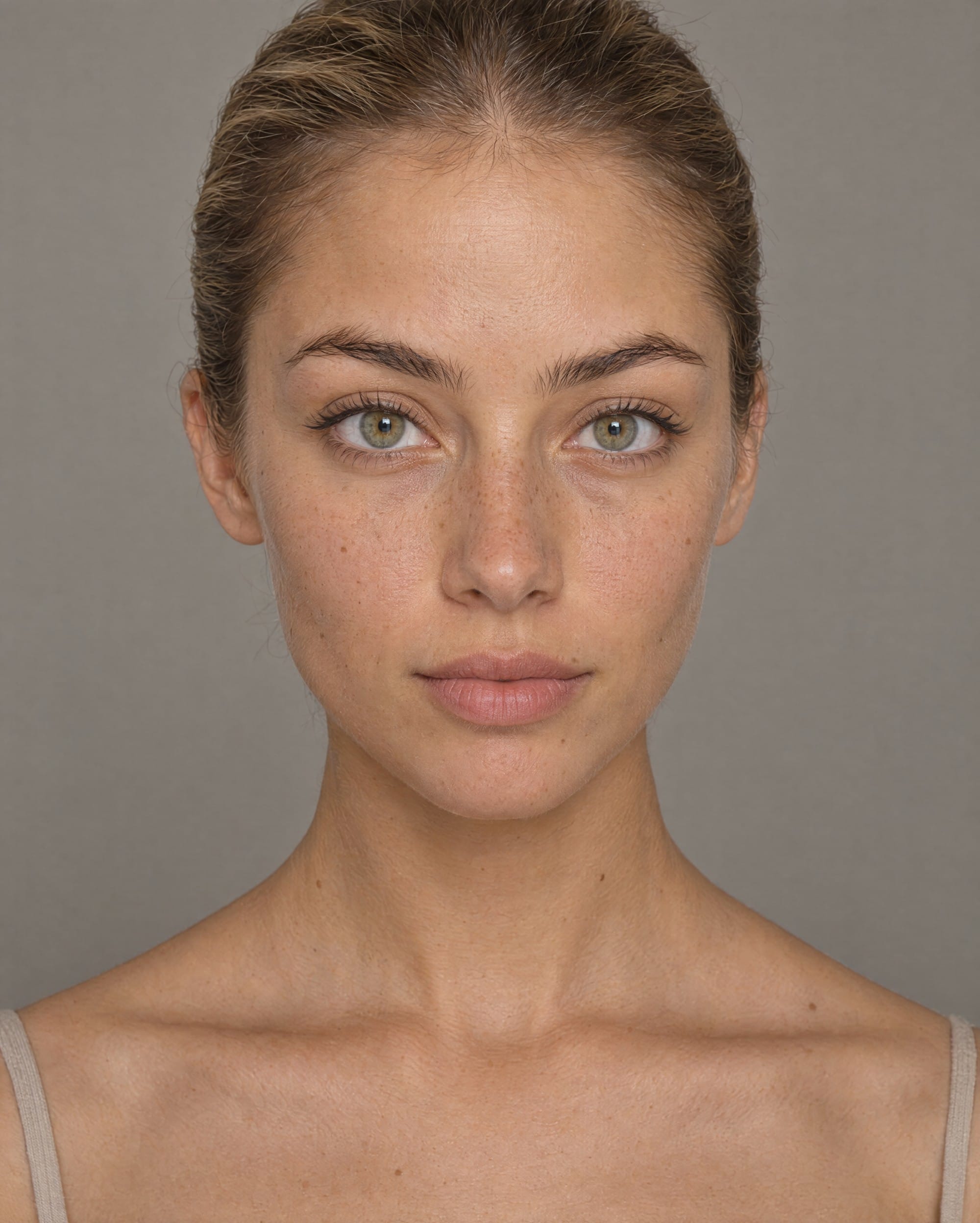
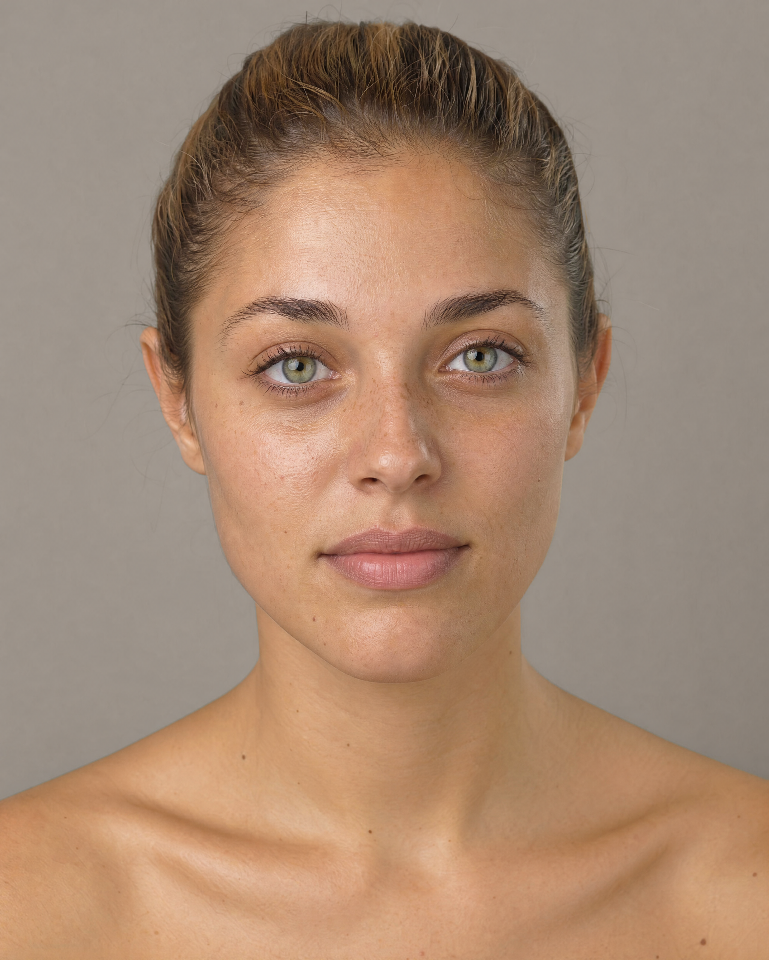
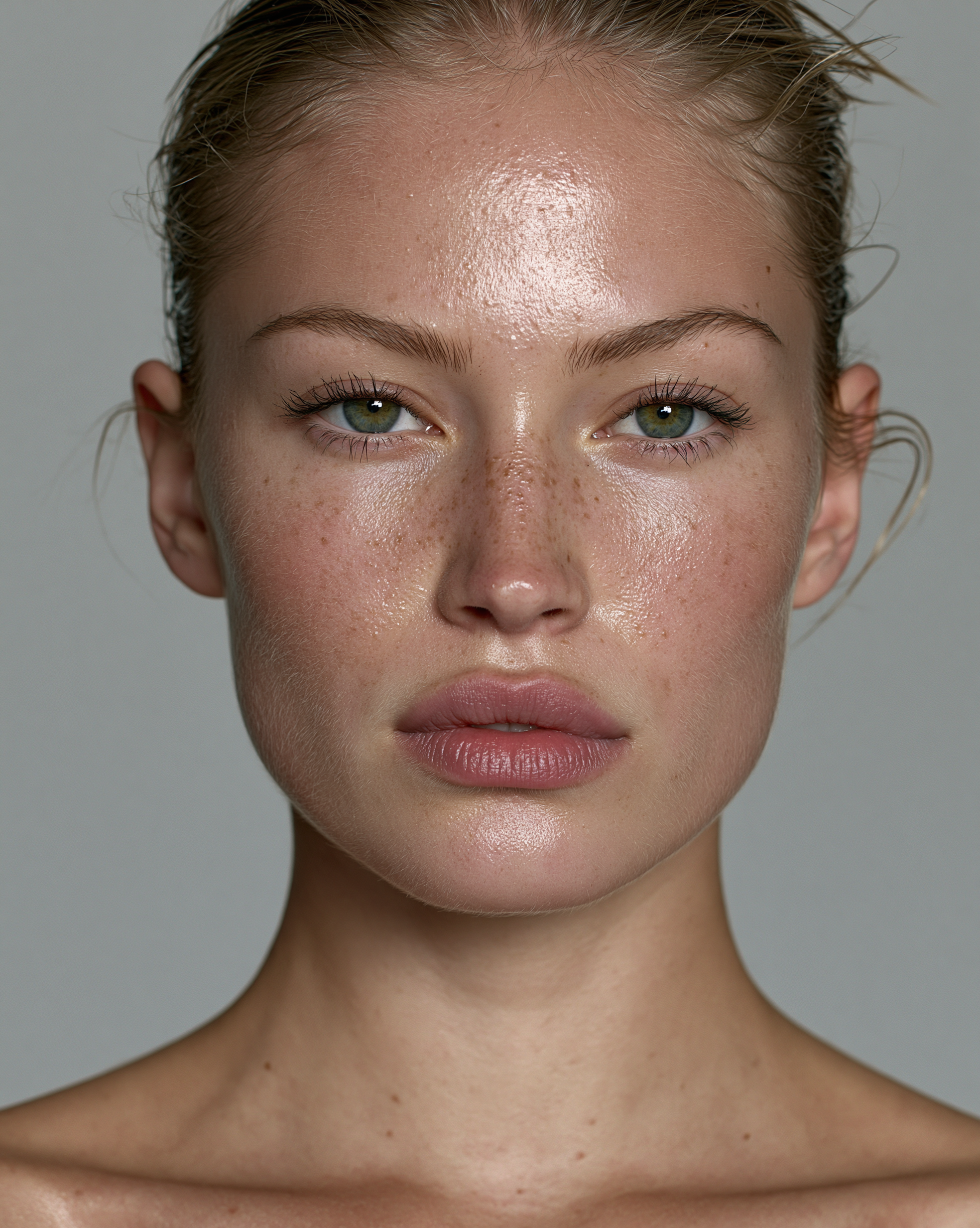
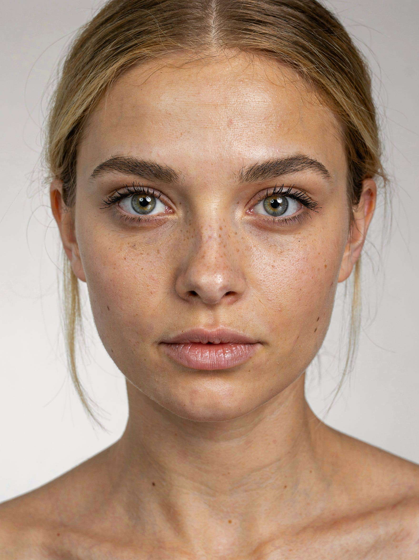
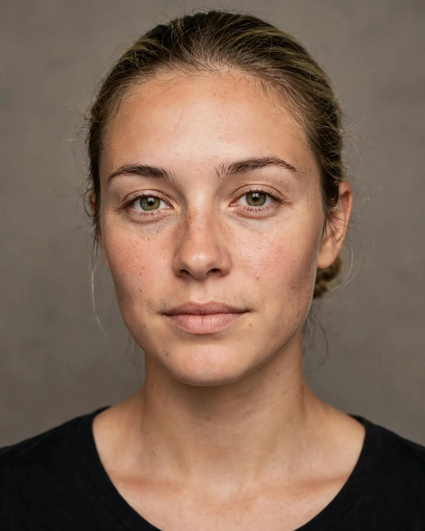
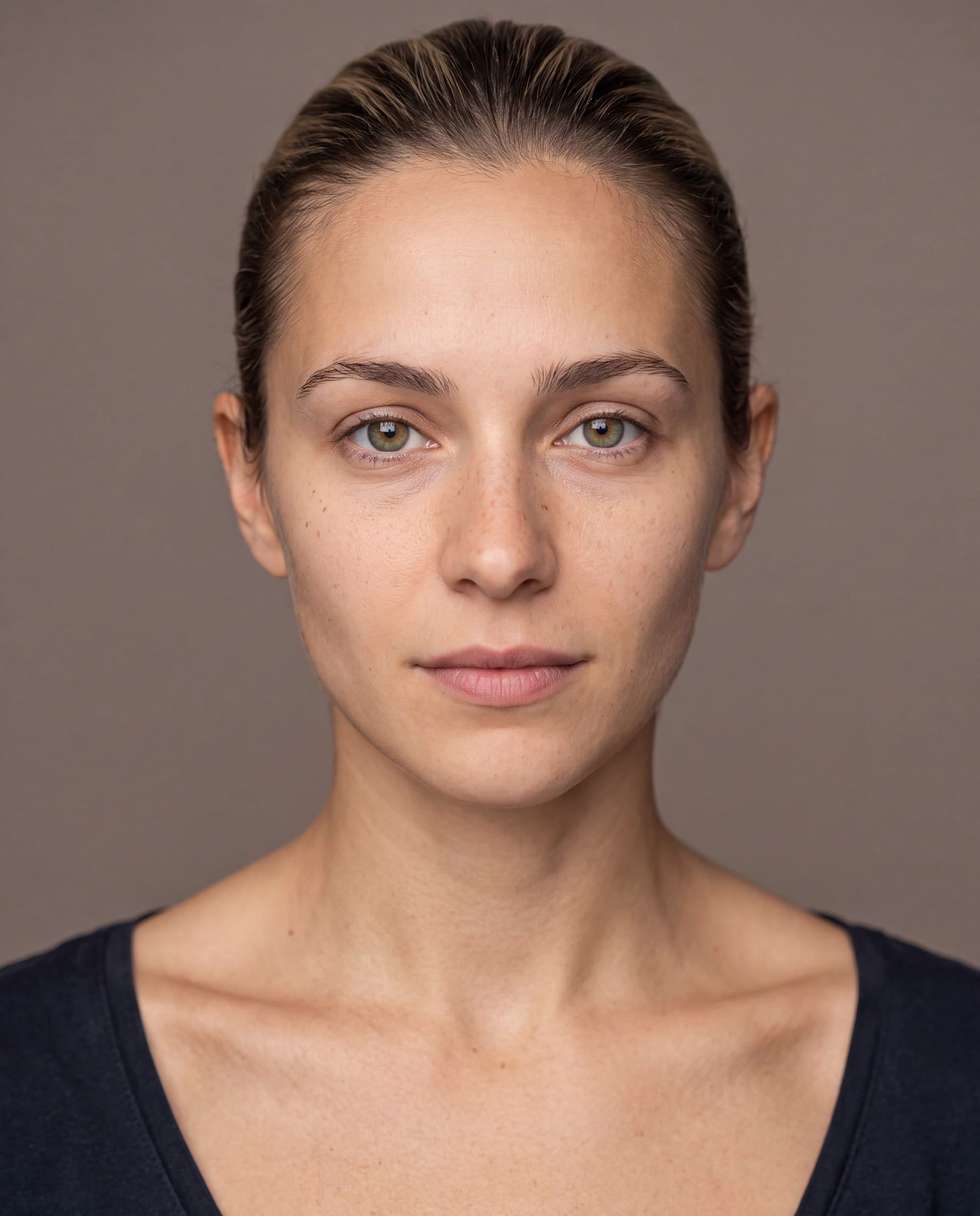
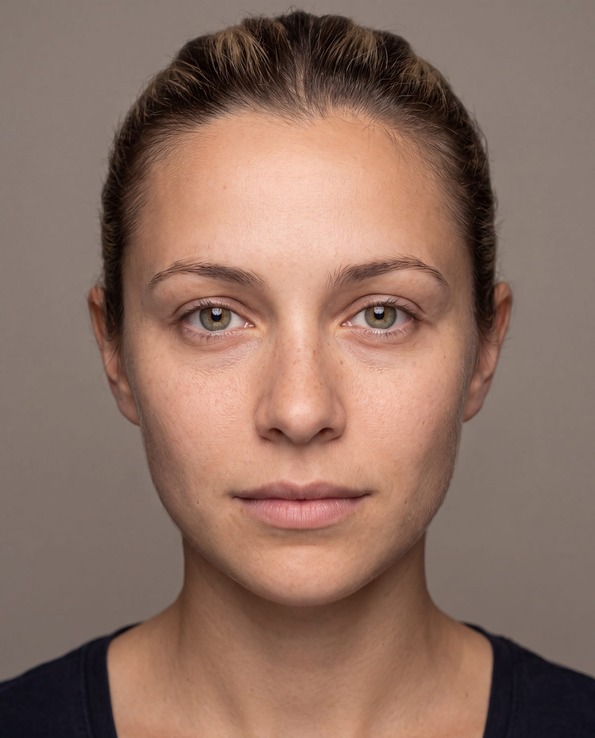
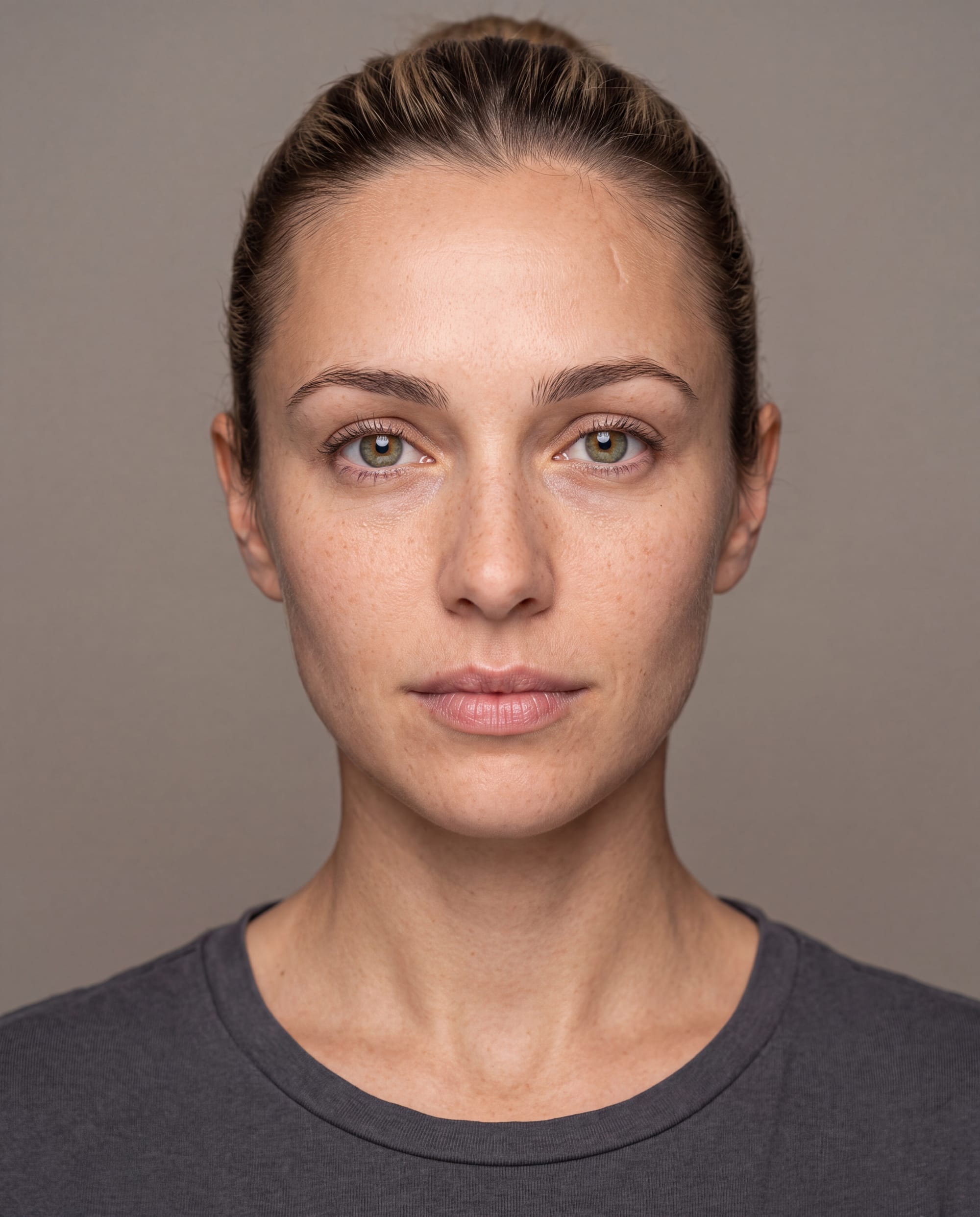
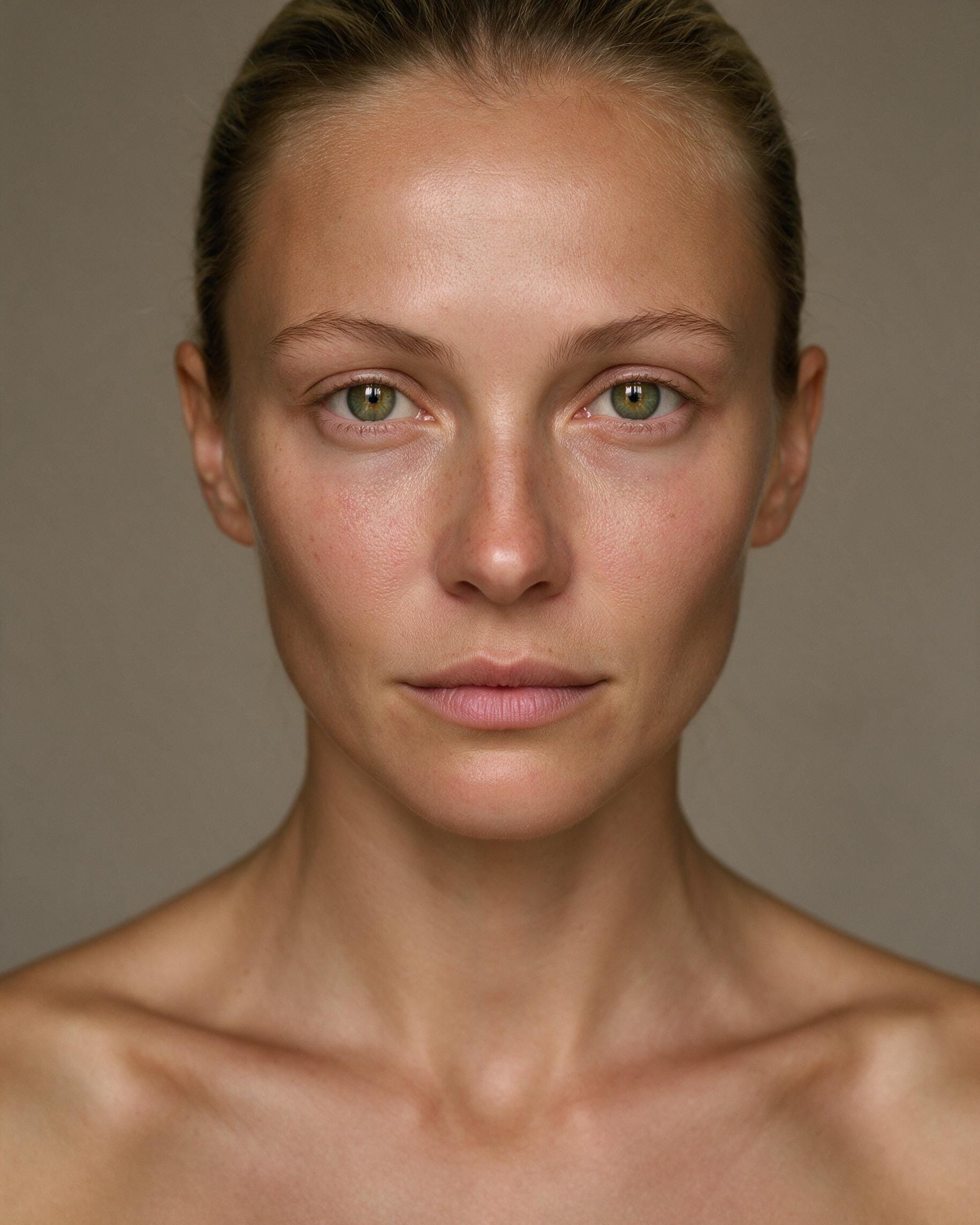
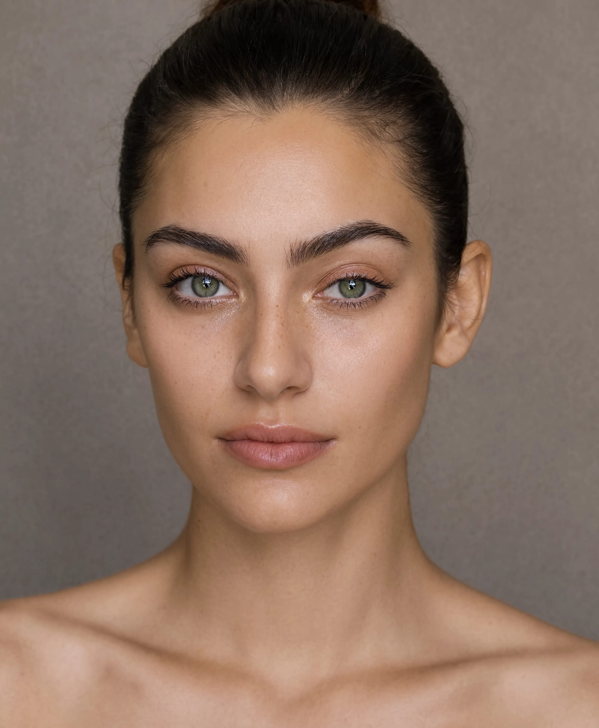
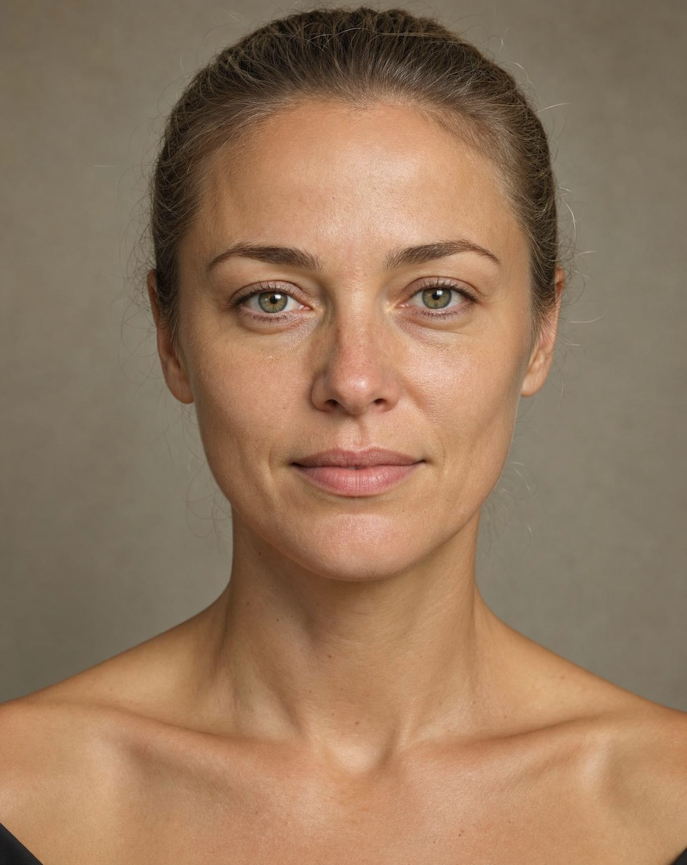
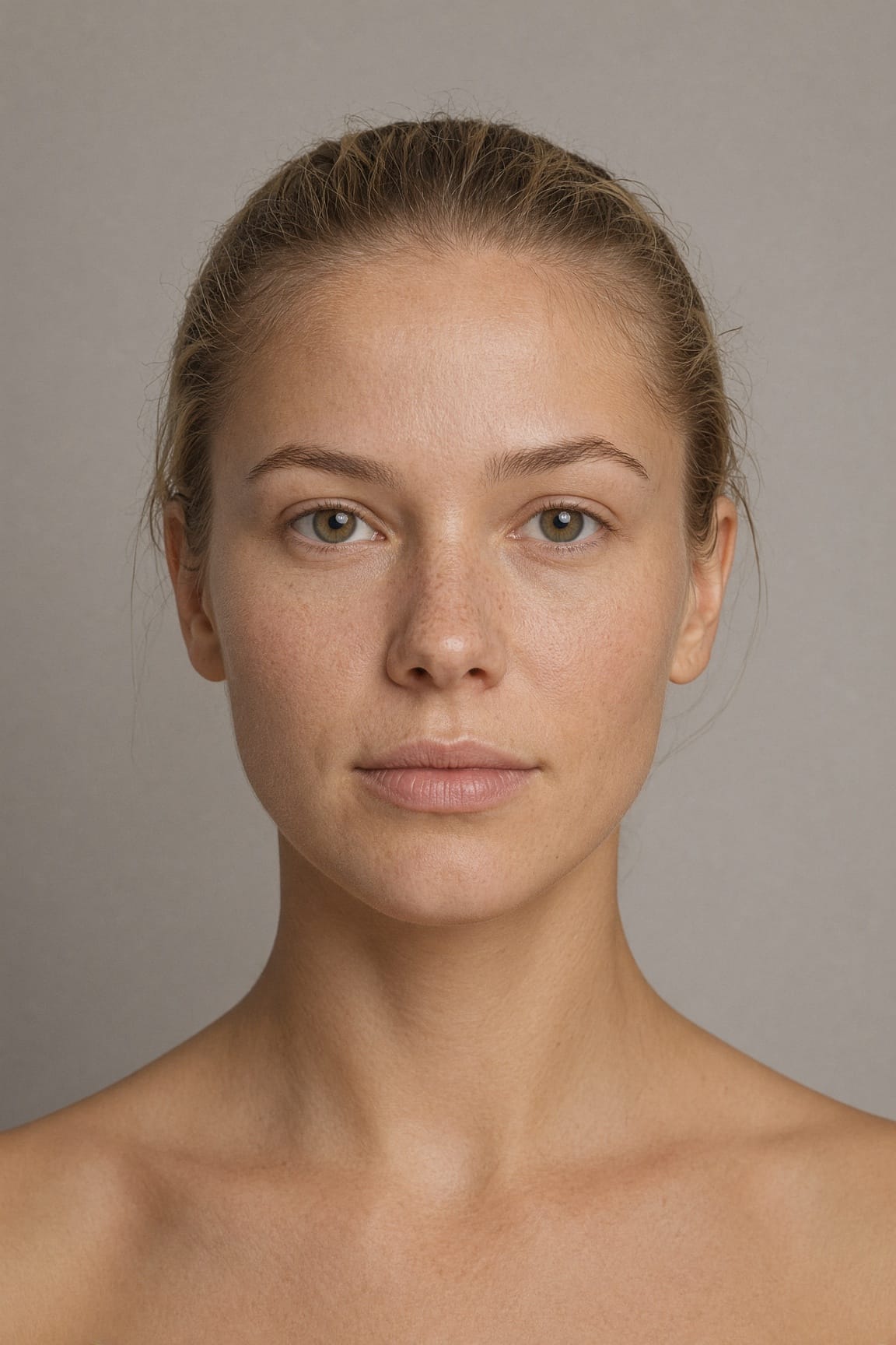
Prompt and settings used for Test 1
Every model received the same underlying description, although we adjusted the formatting slightly when a platform worked better with sections or shorter instructions.
Prompt
Create a photorealistic studio headshot of an attractive 27-year-old woman facing the camera directly. She has light olive skin, green-hazel eyes, a few natural freckles, dark-blonde hair pulled tightly back and a neutral, relaxed expression with closed lips. Show her complete face, neck, collarbones and upper shoulders against a plain warm-grey background.
Use soft frontal studio lighting with realistic skin texture, visible pores, fine peach fuzz, natural under-eye detail, individual eyebrow hairs, detailed irises, subtle facial asymmetry and a believable hairline. Keep the skin natural rather than polished, waxy or airbrushed. No jewellery, dramatic makeup, beauty retouching, artificial bokeh, text or watermark.
Settings
We selected the highest practical native quality available in each interface, used 4:5 where the platform supported it and chose the closest portrait ratio where it did not. We did not edit or upscale the downloaded results. Midjourney returned four images together, so we used the first image from its batch rather than choosing our favourite.
Test 2: Exact medical text inside a photographed monitor
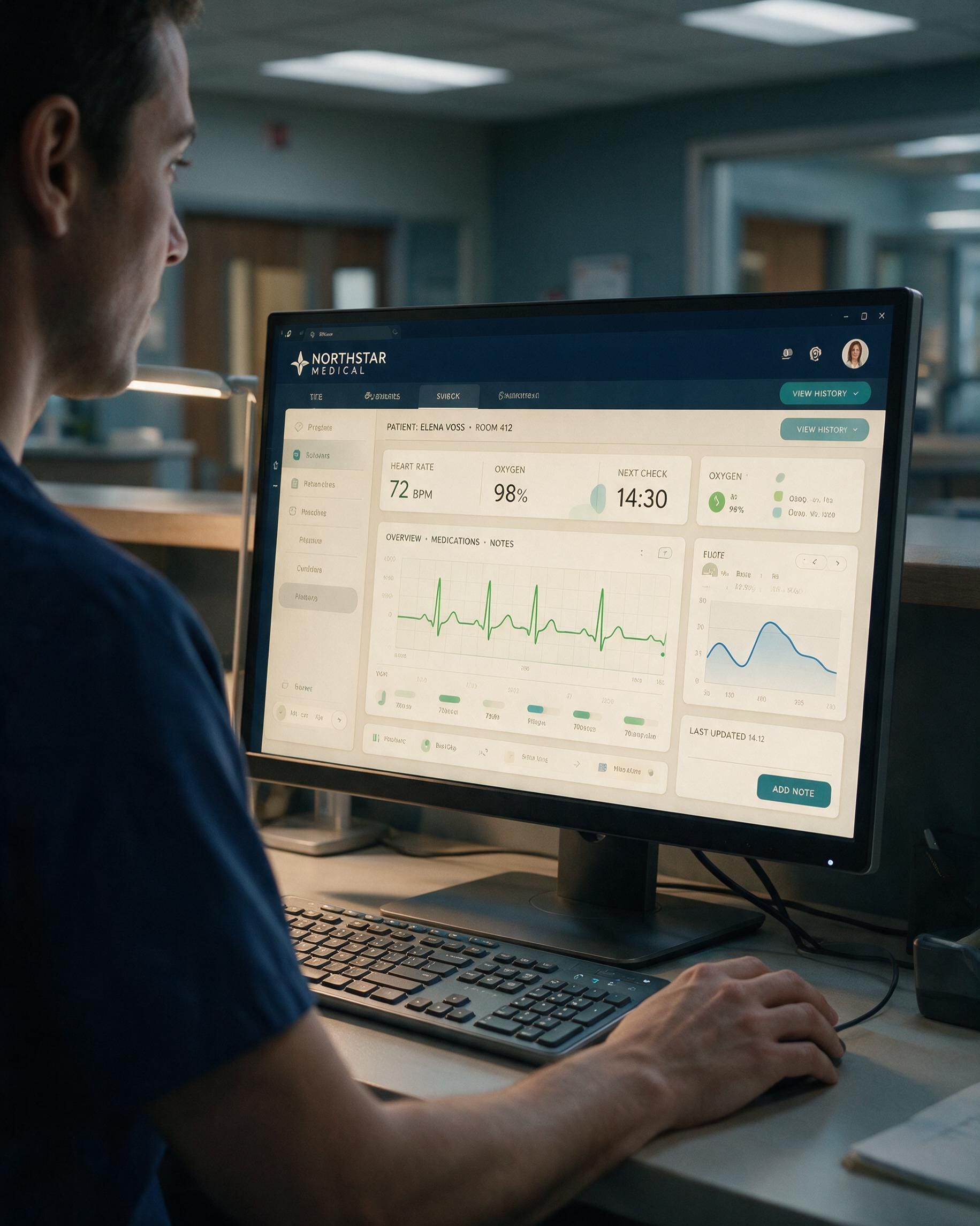
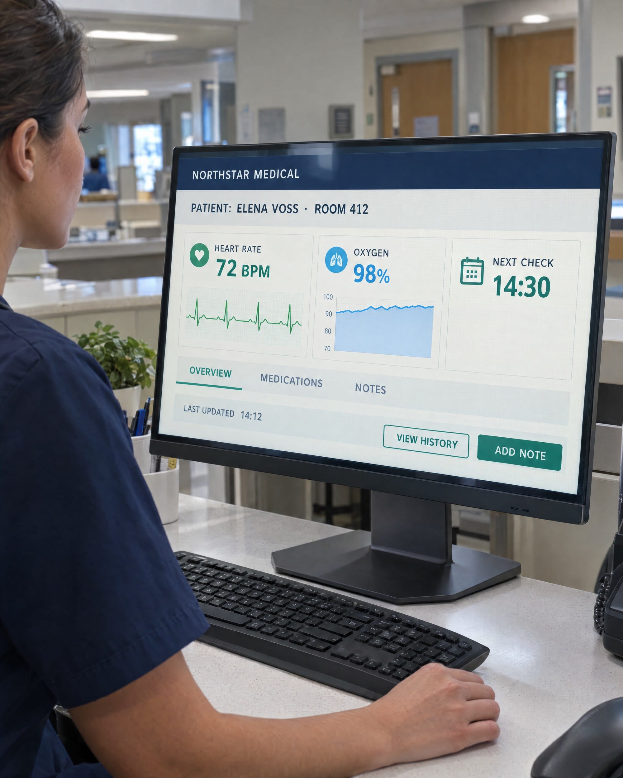
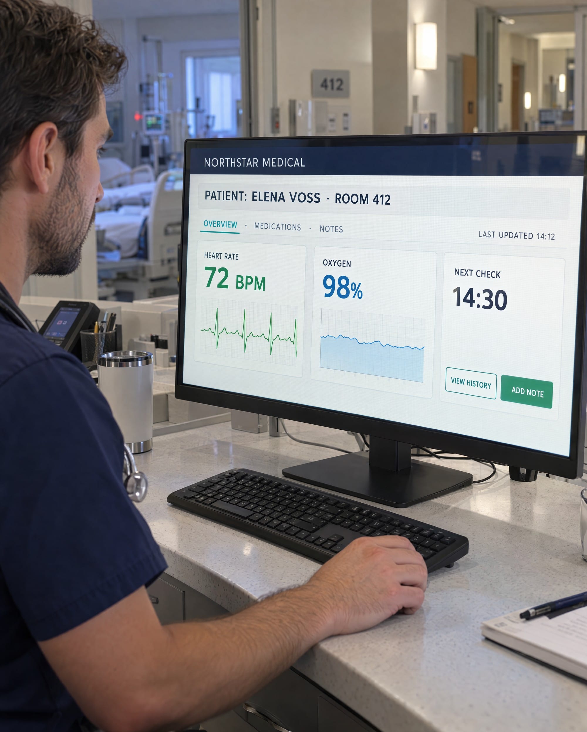
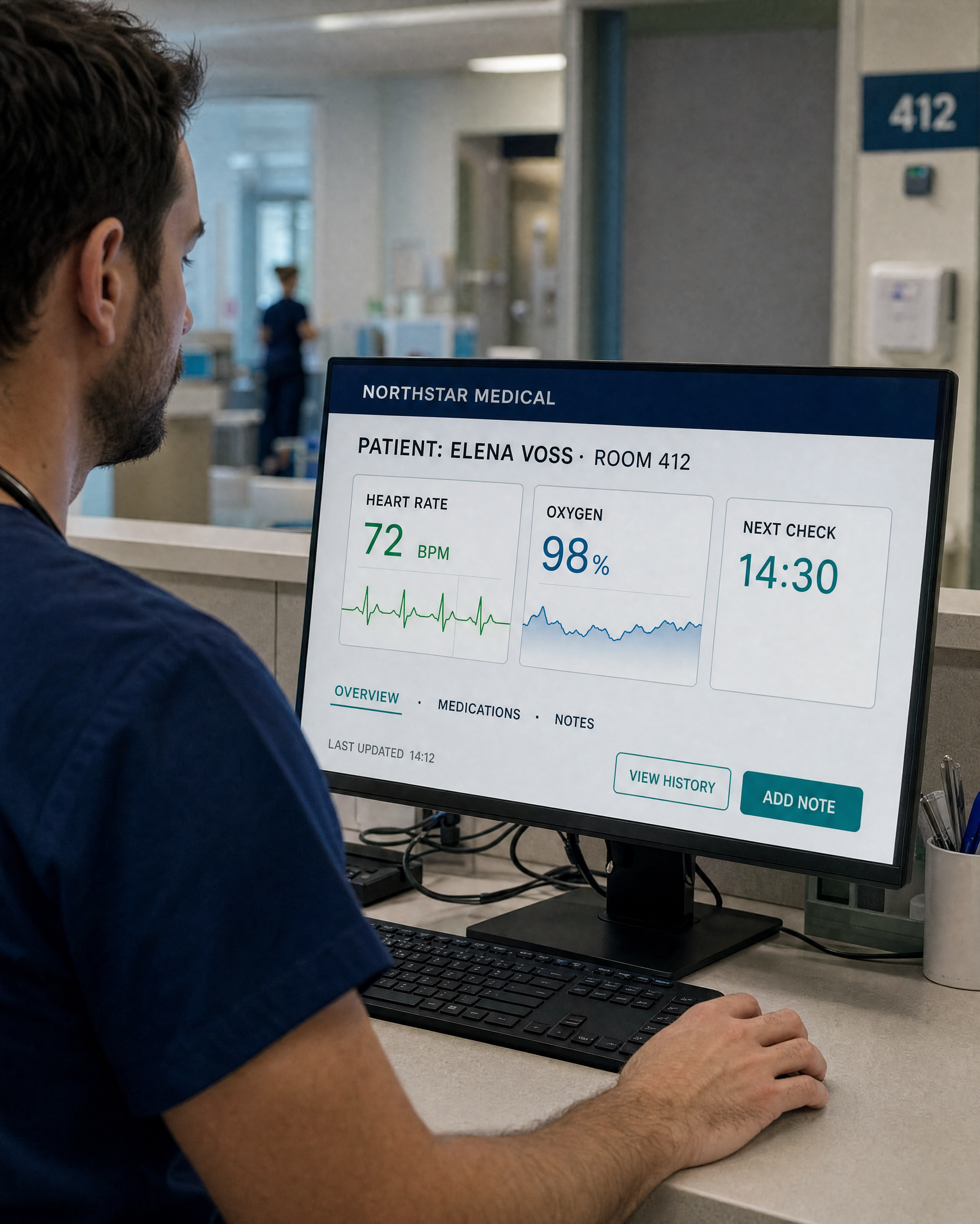
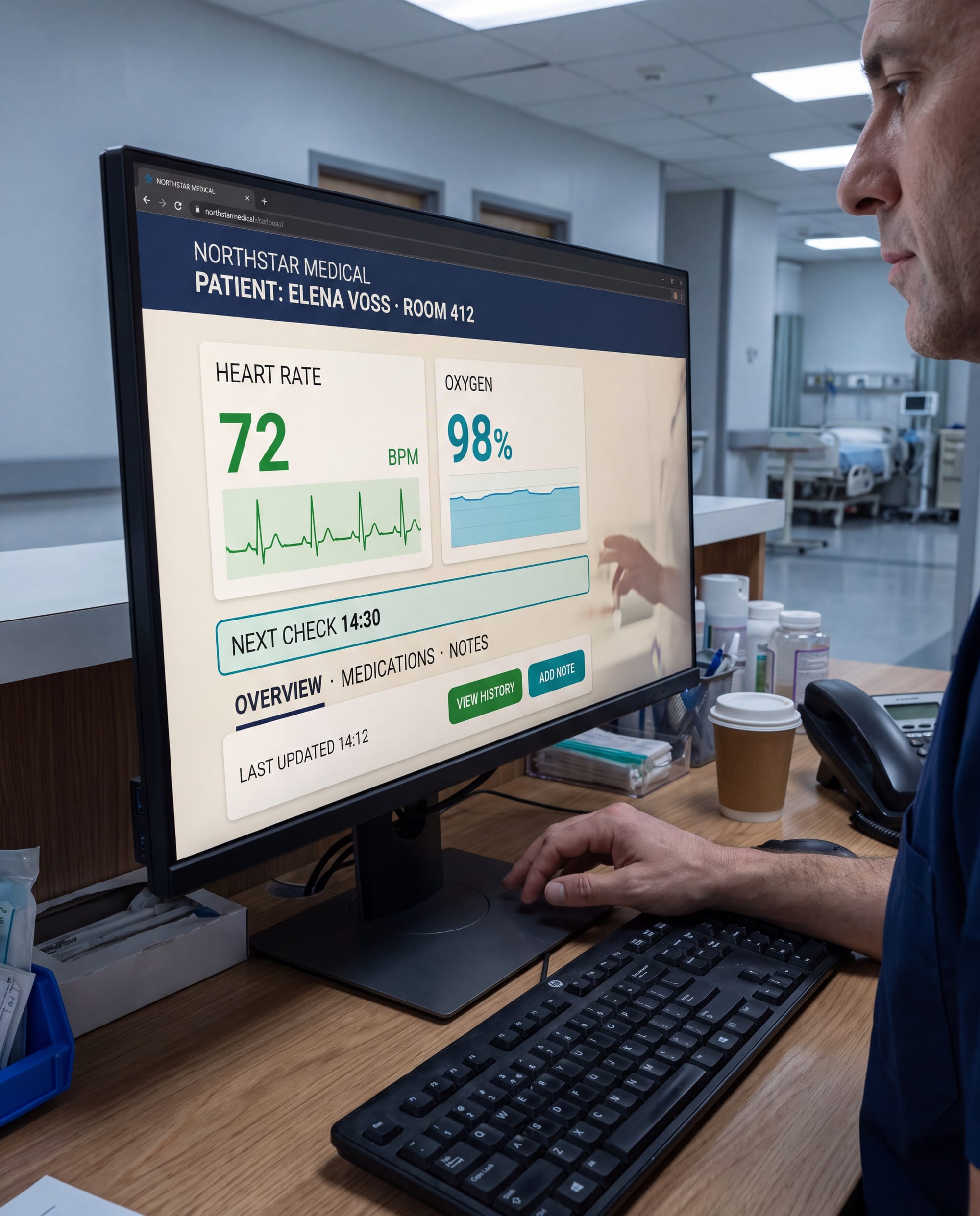
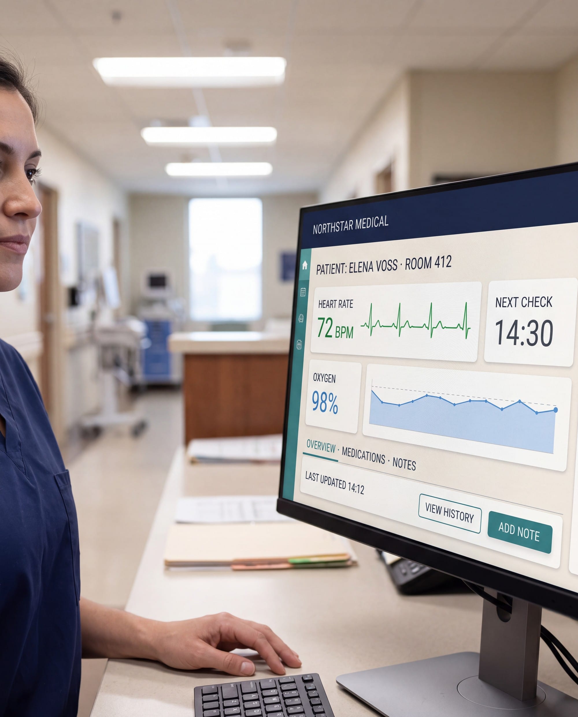
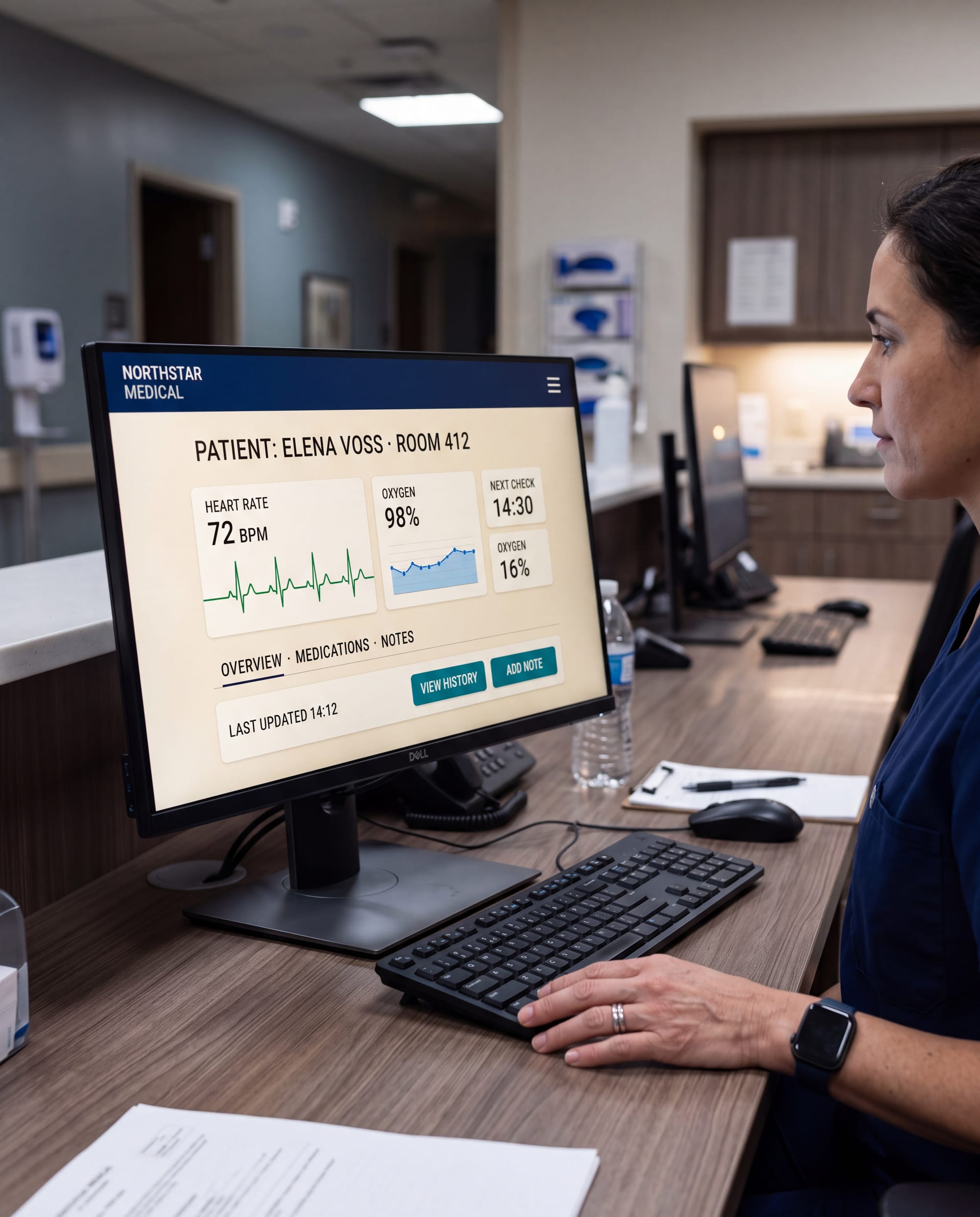
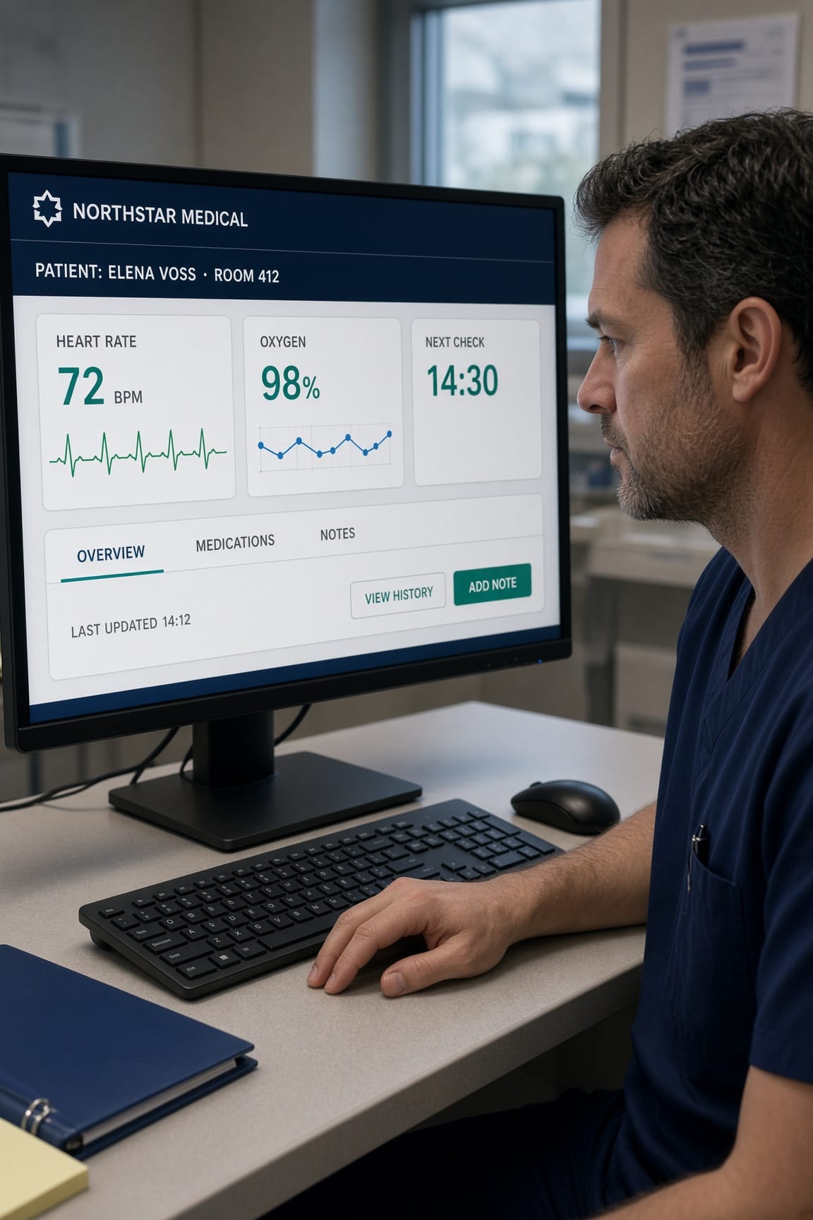
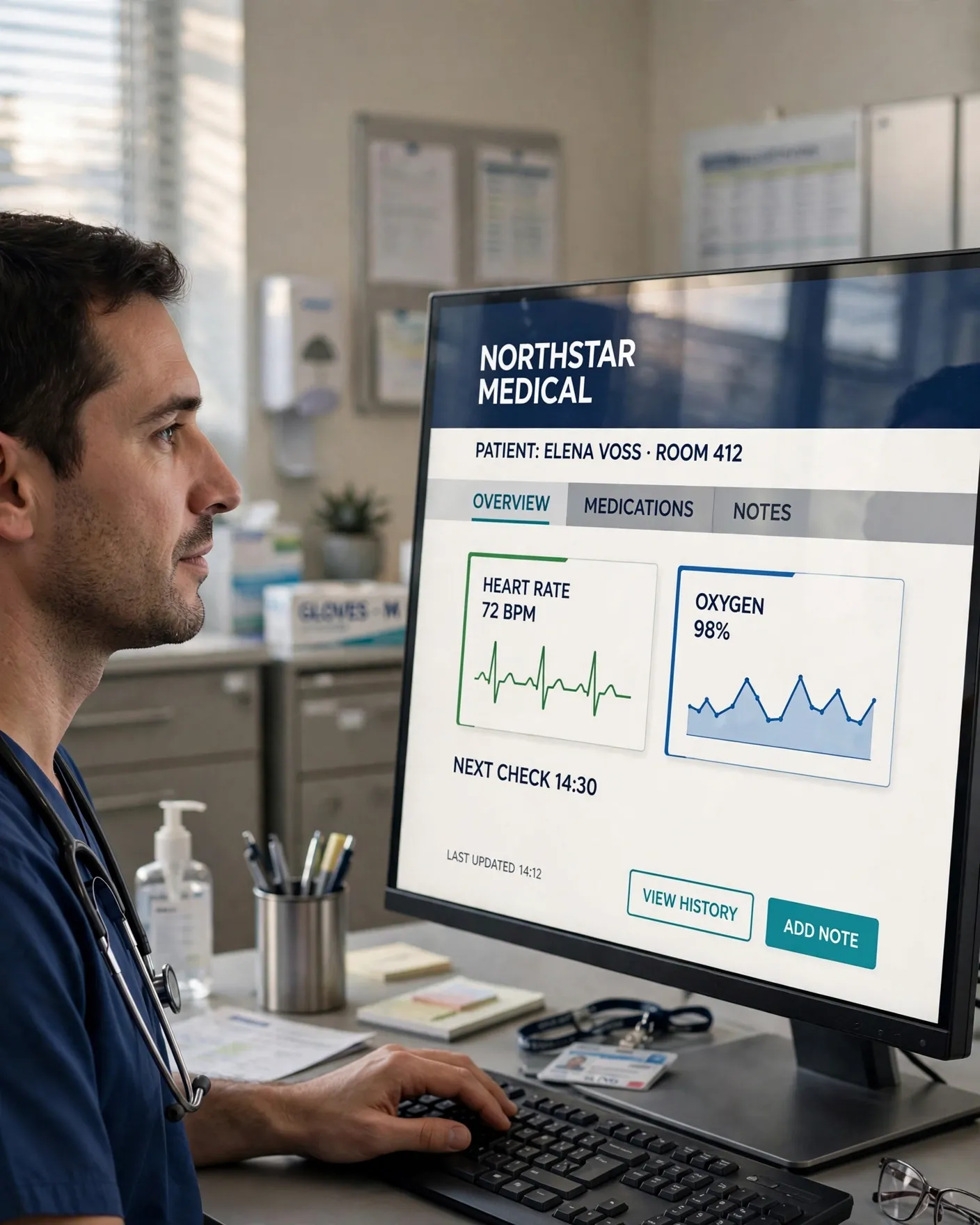
The prompt put a doctor at a nurses' station in front of a 27-inch monitor whose dashboard needed a navy header, data cards, tabs, buttons, a green ECG waveform, a blue oxygen chart and nine lines of exact text, with no other readable words, and it had to sit on the monitor's surface instead of looking pasted over the photo.
Anyone who has asked an AI model for a doctor at a computer knows why we chose this: the doctor looks fine and the screen fills up with melted letters and alien symbols. This time most models got the words right, which made the real difference much easier to see: several produced the same clean, accurate dashboard sitting on the monitor like wallpaper somebody dropped in afterwards, while the best results looked like photographs of a station people work at, with a screen lit like the rest of the room.
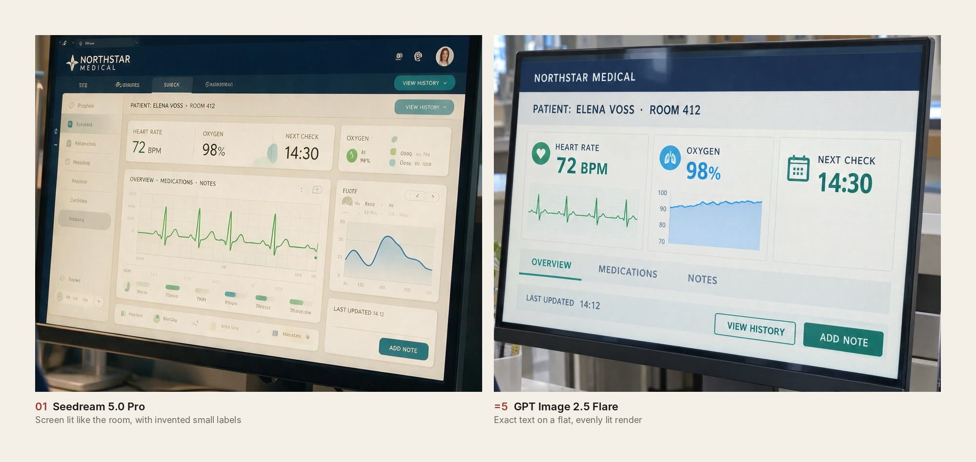
Seedream 5.0 Pro got the lighting right where almost nobody else did. Its monitor is a touch dimmer and warmer than a fresh render, so it matches the room's exposure, and the window controls and dense layout look like real hospital software. Every requested element is there, from NORTHSTAR MEDICAL to the ECG, the oxygen chart and ADD NOTE. The tabs and sidebar do fill up with half-readable invented labels, which the prompt banned, and that cost Seedream some credit but not the win.
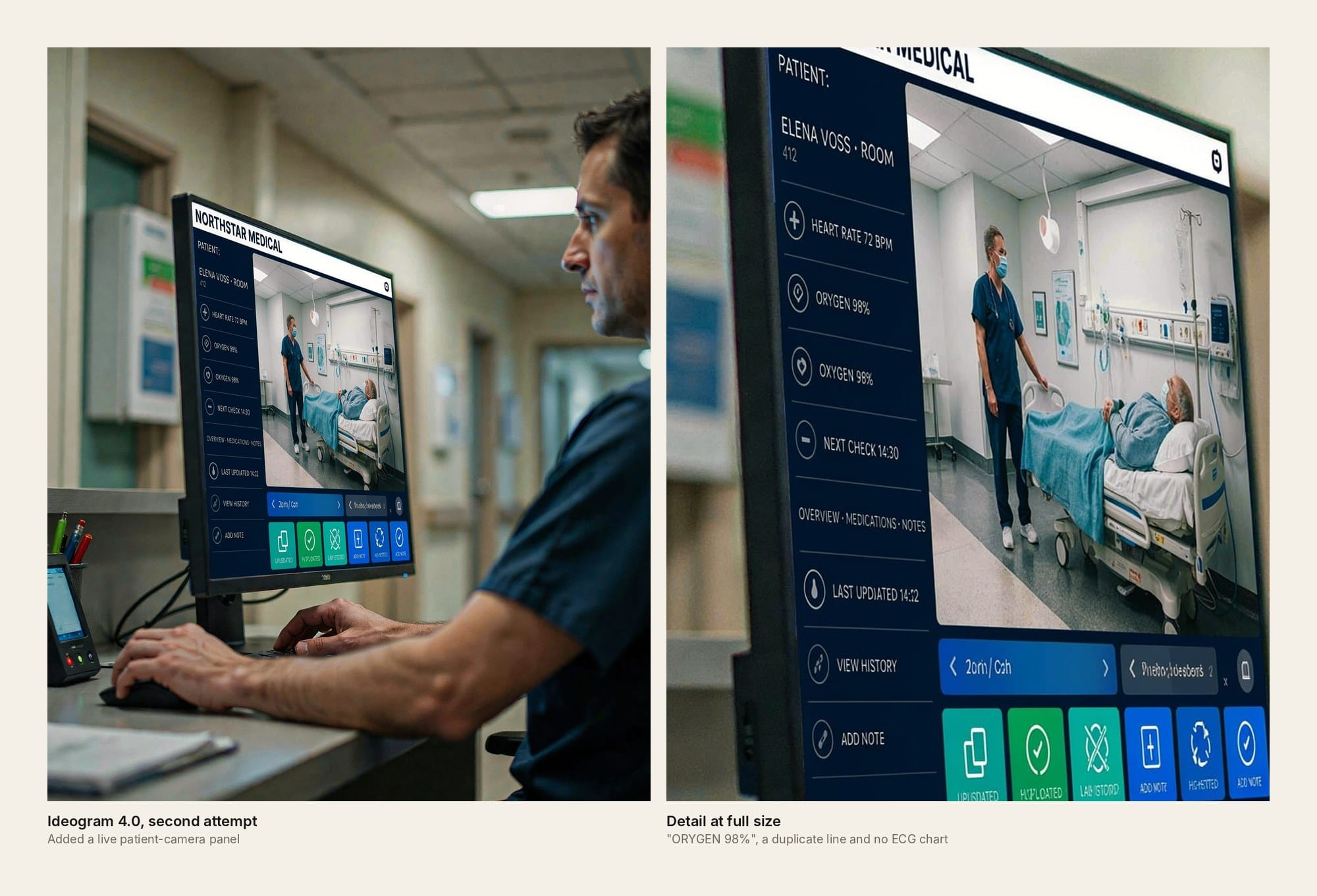
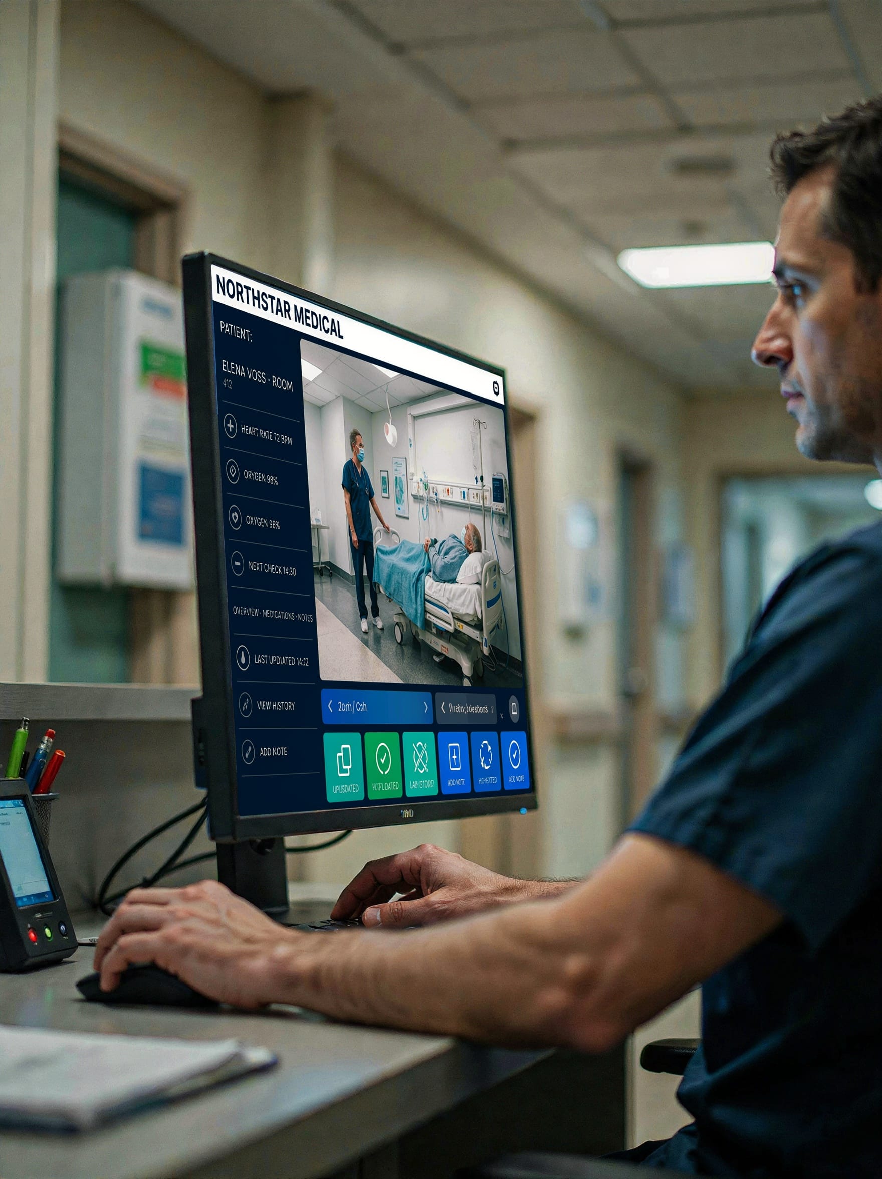
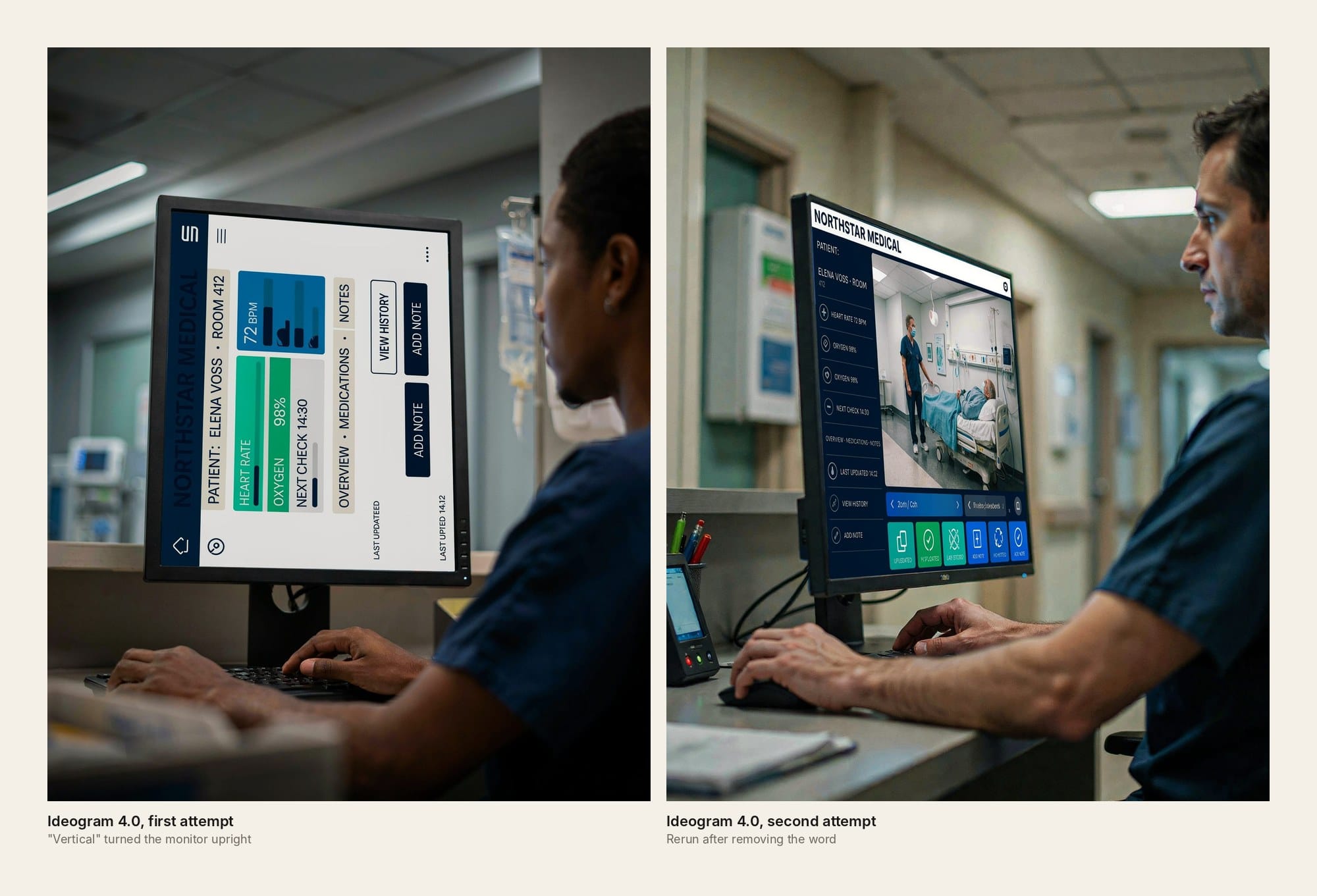
Ideogram 4.0 made the screen we kept going back to. On its rerun it added a live patient-camera panel showing a nurse at a bedside, something we never asked for that makes the whole dashboard feel like part of a working hospital system. It also lost more of the brief than Seedream:
- "OXYGEN 98%" appears once as "ORYGEN 98%" and then again as a duplicate line.
- The camera feed took the place of the ECG and oxygen chart we asked for.
- The button row underneath turns into words like "UPLSDATED".
The idea earned second place, and the missing charts kept it there.
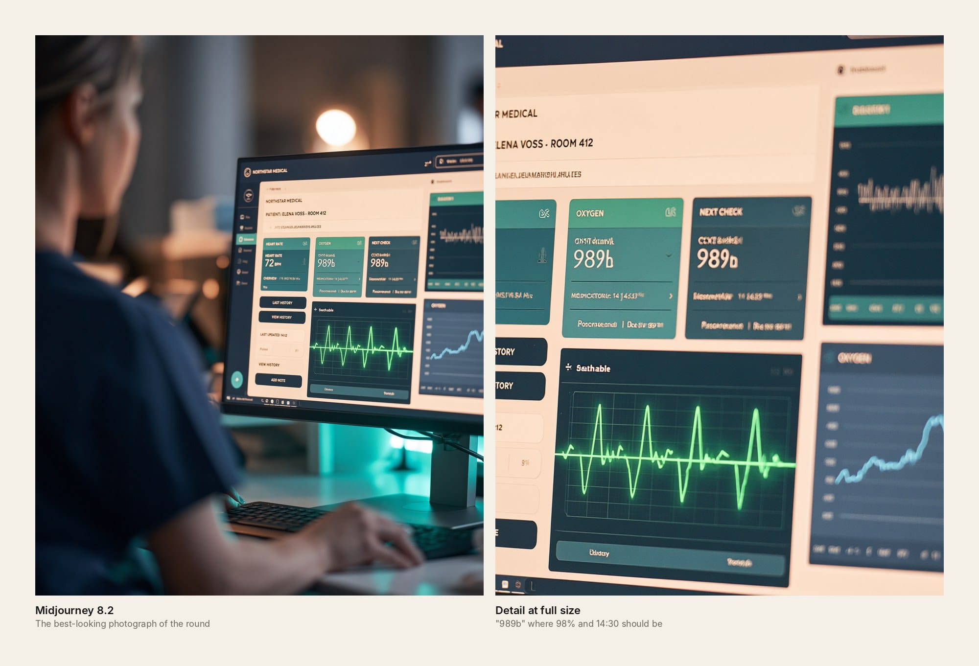
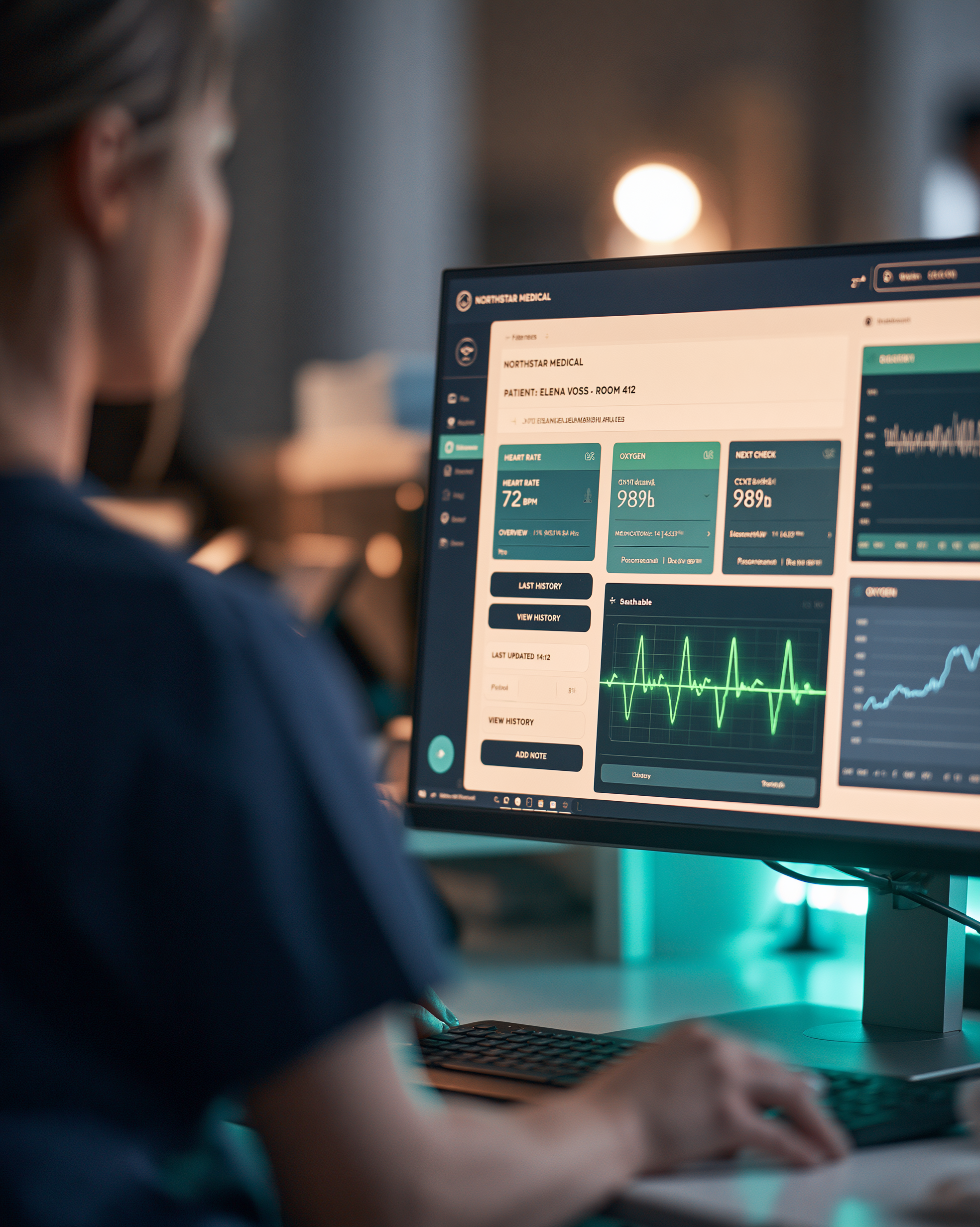
Midjourney 8.2 took the best-looking photograph of the round: the doctor seen from behind, a teal-lit station, a lamp glowing in the background, and a screen that belongs in that room completely.
Then you zoom in. The oxygen card says "989b", the NEXT CHECK card says "989b" too, and 14:30 is nowhere. Those are numbers we asked for, so this is a real failure rather than background text going soft, and only the photograph holds Midjourney in third.
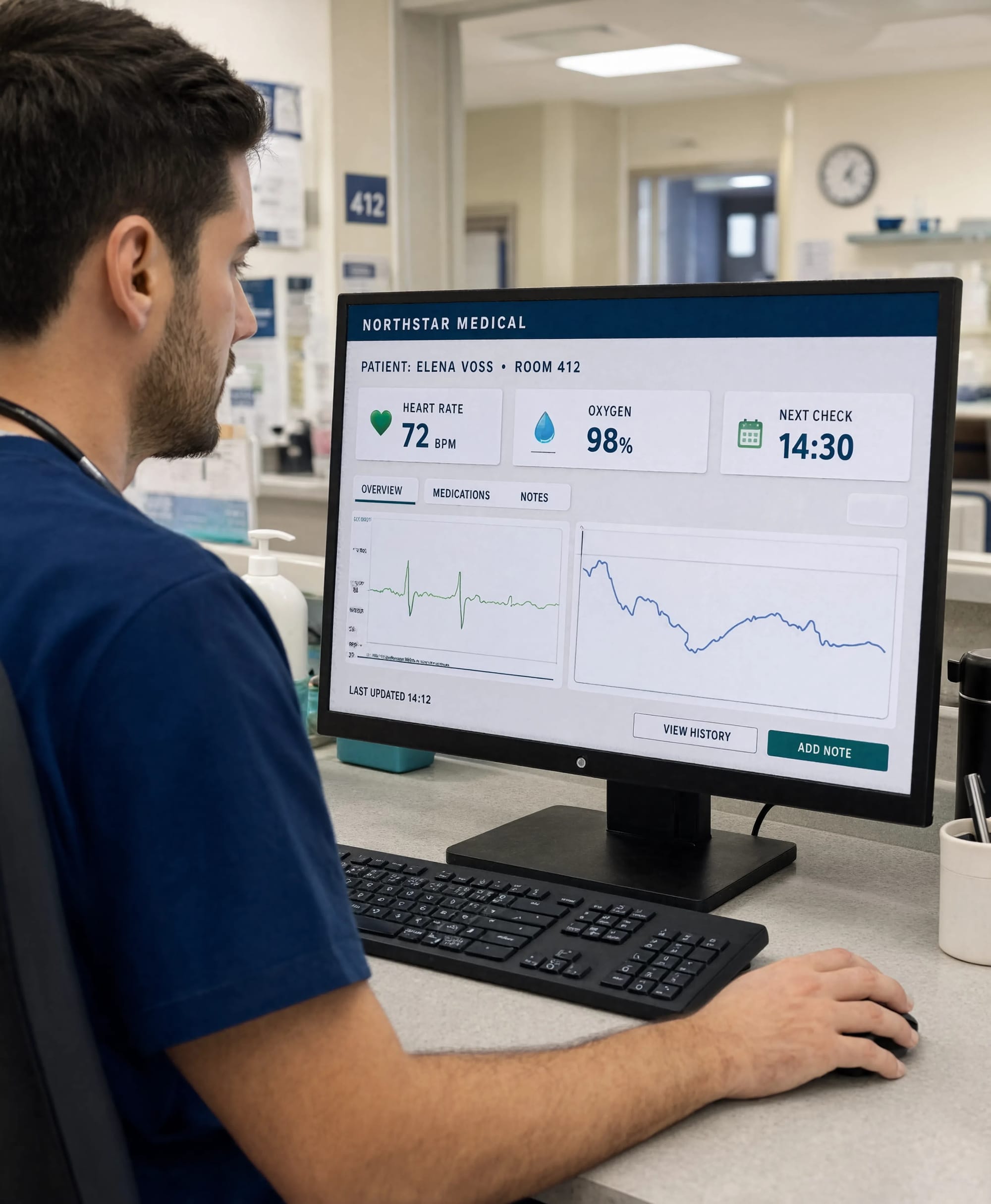
Reve 2.1 handled the monitor angle more naturally than most and kept the doctor and screen in one convincing shot. Its core text is right, and only a few tiny chart labels fall apart at full size, which puts it fourth.
Flare and Sunburst share fifth. Their people look real, and their text stays crisp and exact even where it runs away at an angle; the only extras are some chart-axis numbers in Flare's oxygen panel. We prefer Flare's monitor angle, and Sunburst deserves credit for the patient bed it put in the room behind the station. Both compositions are still the plainest of the top six, with dashboards that look like a clean render sitting on the monitor.
Zoom into the four models above them and the lettering is softer, with a slight glow that makes it less firm than the GPT text, but each of those images looks real in its own way, while the GPT pair look like the same clean idea done twice.
GPT Image 2 is seventh, accurate and neat but nothing special, like many other below them, each one were pretty much from same baker.
Below that, the round falls off a cliff, so almost every remaining model got its text right, and not one of them produced a person who looks alive: the doctors sit in stiff poses with smooth, expressionless faces, staring at their screens like NPCs nobody has spoken to yet. Nano Banana Pro's doctor is the least lifeless of the group and its station has some depth, which puts it eighth, although it painted a faint hand into the monitor, as if a reflection had become part of the interface. Nano Banana 2.1 has strong perspective and exact text, but its interface sits on the screen like a separate layer, something we've seen from Google's models before. Nano Banana 2 invented a second reading, "OXYGEN 16%", which turns a plain screen into a wrong one.
Grok and Meta Muse produced the most NPC-looking images of the round. Both gave us the same default AI doctor: dark hair, neat stubble, a rigid side profile and a blank stare at a screen that faces the camera almost flat, as if somebody dropped a character from a stock pack in front of a slide. Grok also added a star logo beside NORTHSTAR MEDICAL after we banned fake logos. Muse got every line of text right, then pasted the dashboard across the monitor with an oversized header and filled the desk with props, a badge, glasses and sticky notes, that make the scene busier without making it more real. MAI-Image 2.6 Preview never returned the scene in roughly ten attempts, and an empty result is still what the user gets.
Prompt and settings used for Test 2
Every model received the same medical information, scene and screen requirements. The formatting was adjusted slightly for different interfaces, but the requested wording and visual task remained the same.
Prompt
Create a photorealistic hospital photograph showing a doctor in navy scrubs working at a modern nurses’ station during a quiet early-morning shift. Show the doctor in three-quarter profile, with part of the face visible and one natural hand resting beside the keyboard.
Place a 27-inch desktop monitor prominently in the scene, occupying approximately 45% of the image. Turn the screen only slightly away from the camera so the complete interface remains readable while still looking like a real monitor inside a photograph.
Display a believable hospital patient dashboard with a dark navy header, warm off-white panels, restrained teal and green colours, aligned data cards, navigation tabs and working buttons. Include a green ECG waveform showing a stable rhythm and a blue oxygen-level chart.
Display exactly this text:
NORTHSTAR MEDICAL
PATIENT: ELENA VOSS · ROOM 412
HEART RATE 72 BPM
OXYGEN 98%
NEXT CHECK 14:30
OVERVIEW · MEDICATIONS · NOTES
LAST UPDATED 14:12
VIEW HISTORY
ADD NOTE
Preserve every word, number and punctuation mark. Do not add other readable words, random characters, fake logos, floating interface elements, holograms or a watermark. Add realistic screen pixels, mild glare, reflections, keyboard detail and normal hospital lighting. The dashboard must follow the monitor’s surface and perspective rather than looking pasted over the photograph.
Settings
We used the highest practical native quality available and a portrait ratio supported by each platform. No screen text was repaired, replaced or corrected afterwards. We kept the first valid image, while MAI-Image 2.6 remained a failed result because it did not return the requested scene despite repeated attempts.
Test 3: Product scale, spatial accuracy and advertising quality
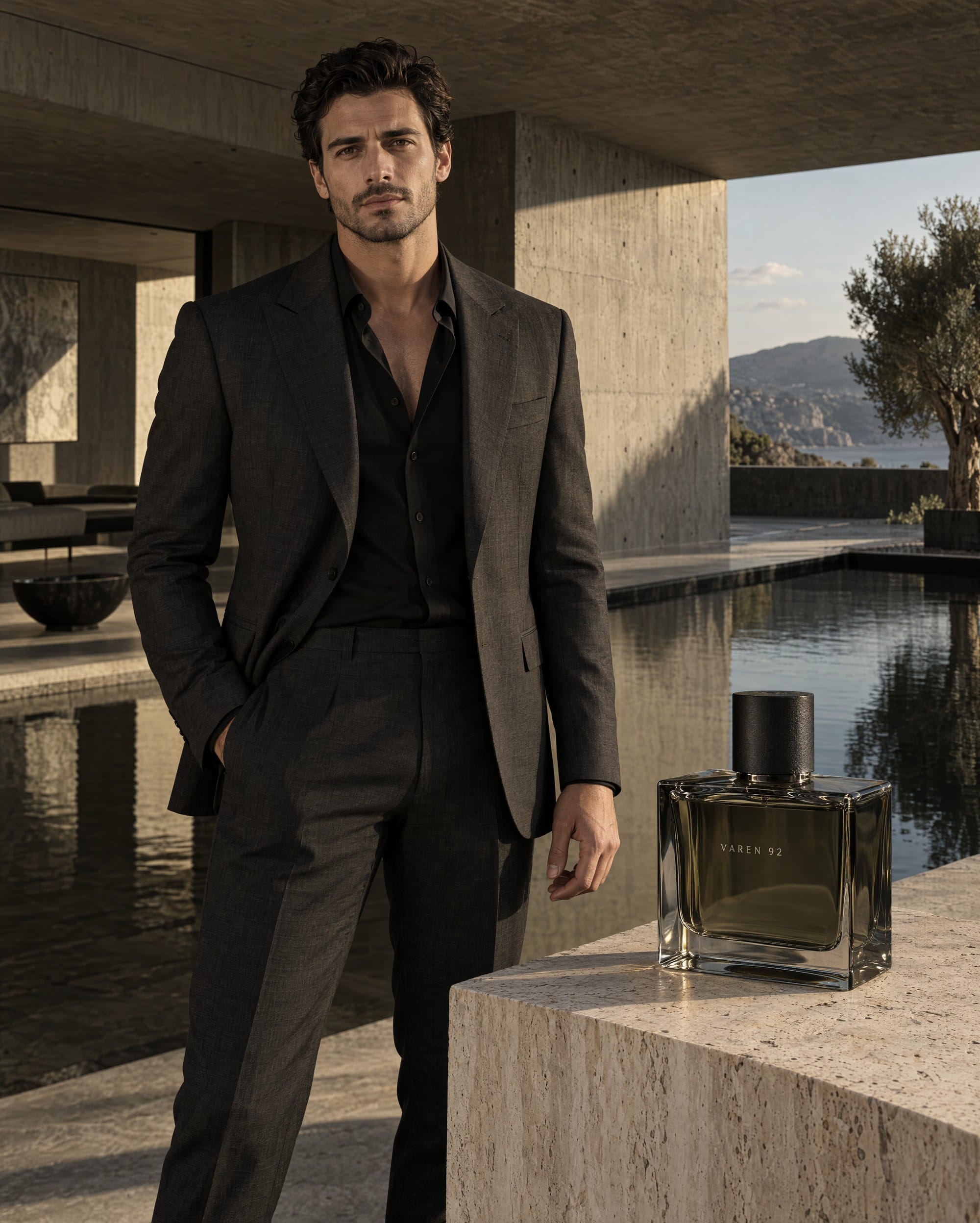
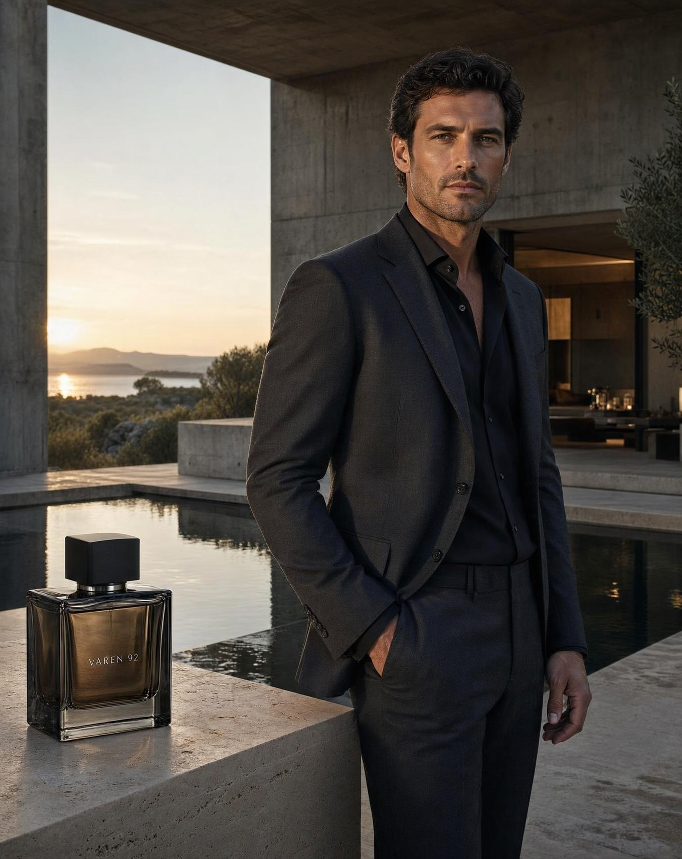
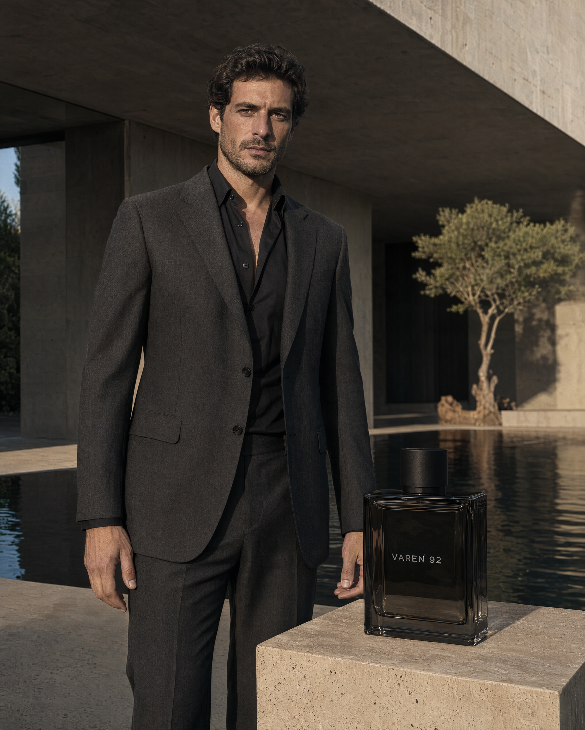
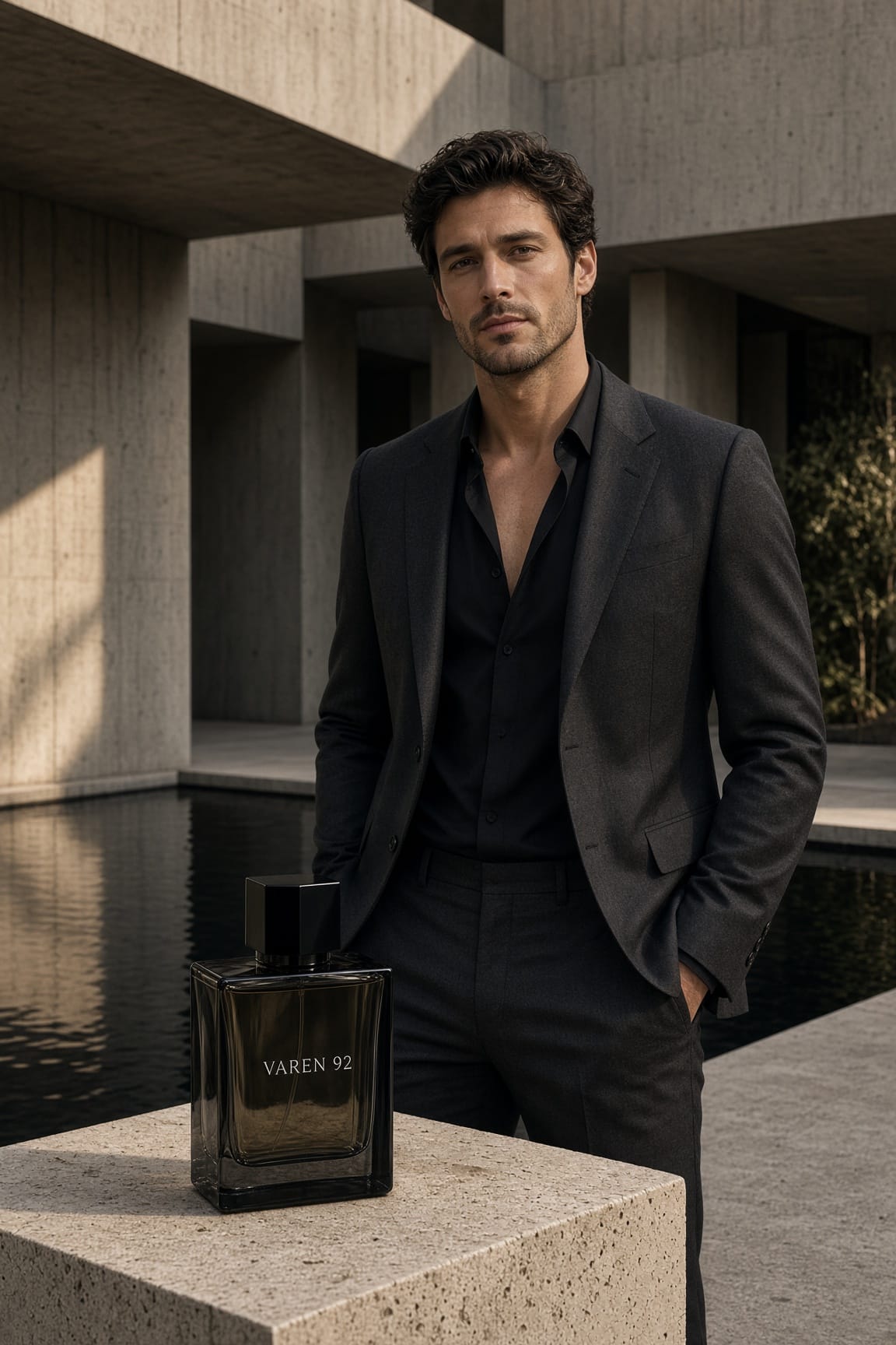
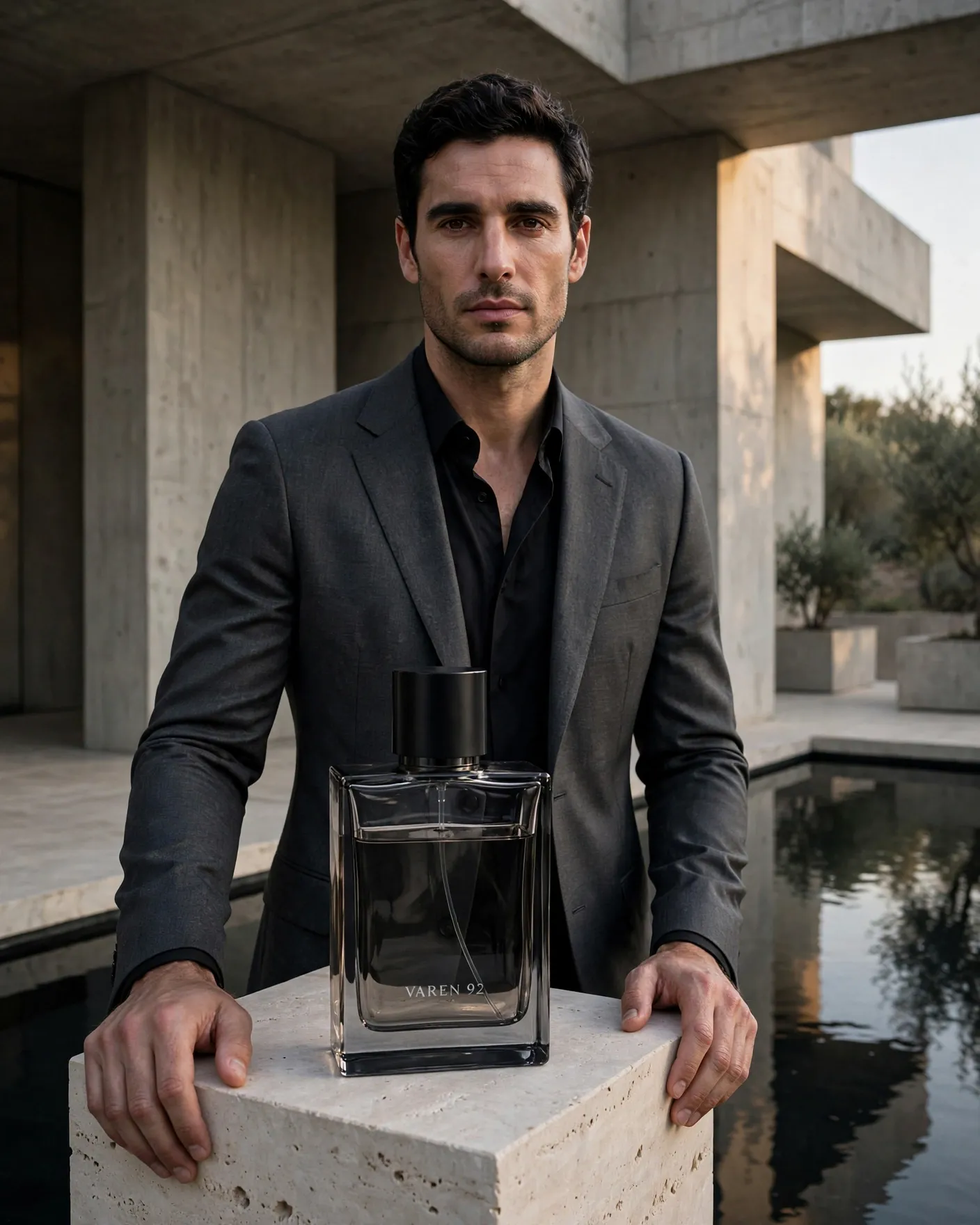
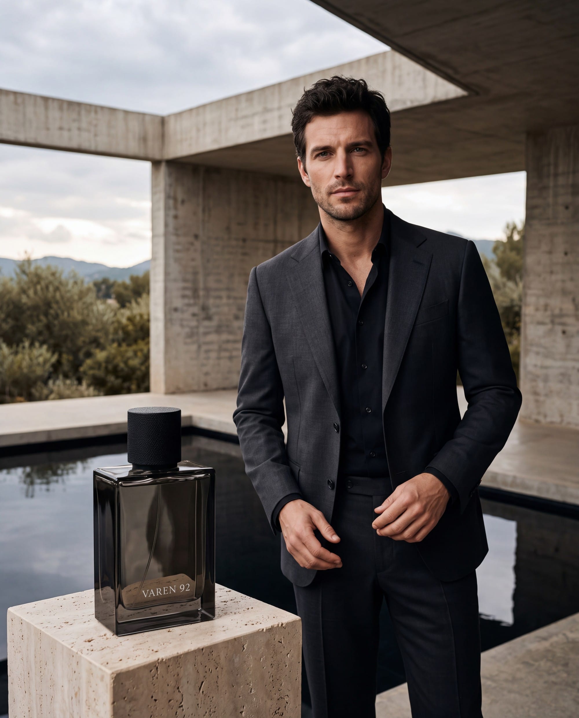
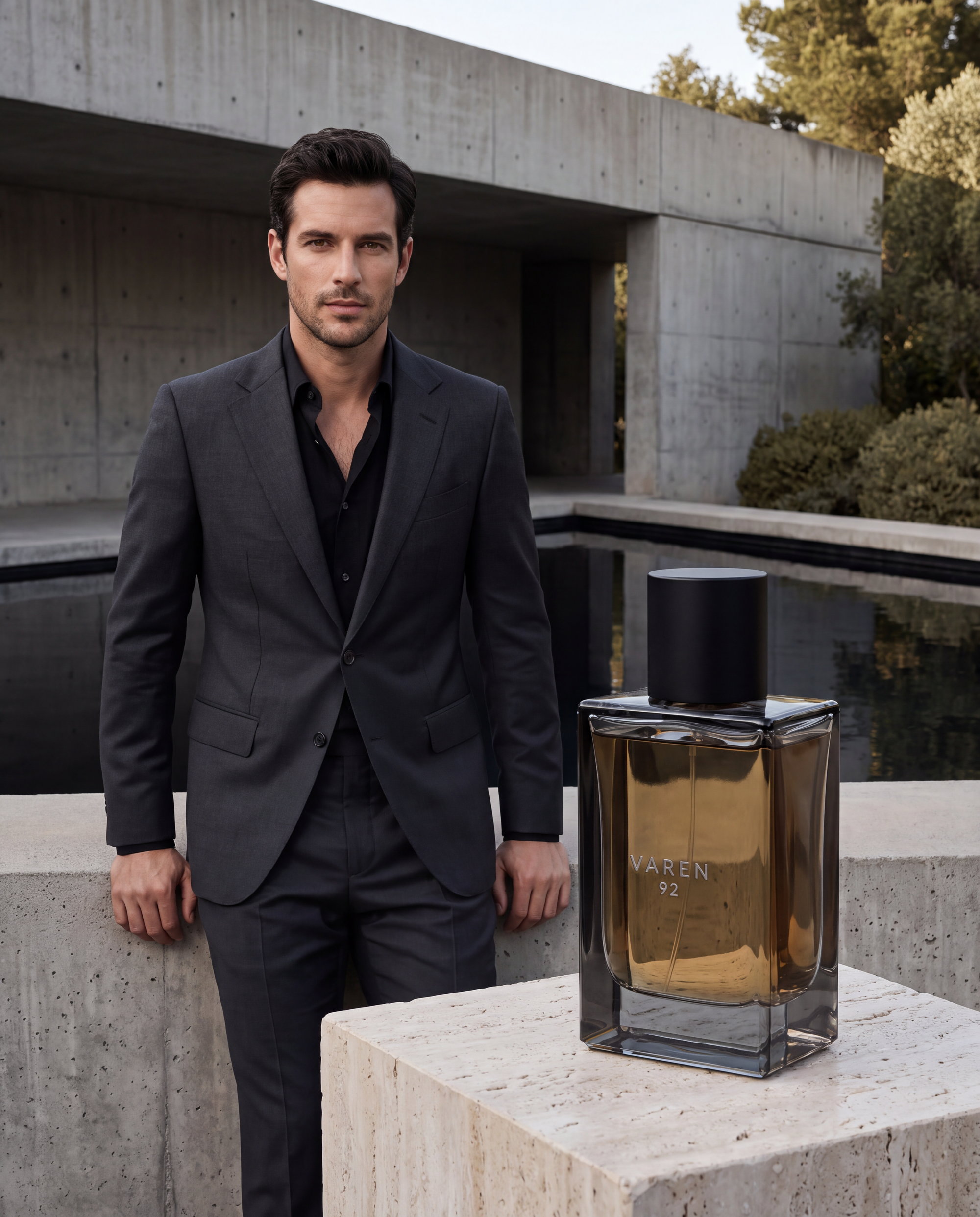
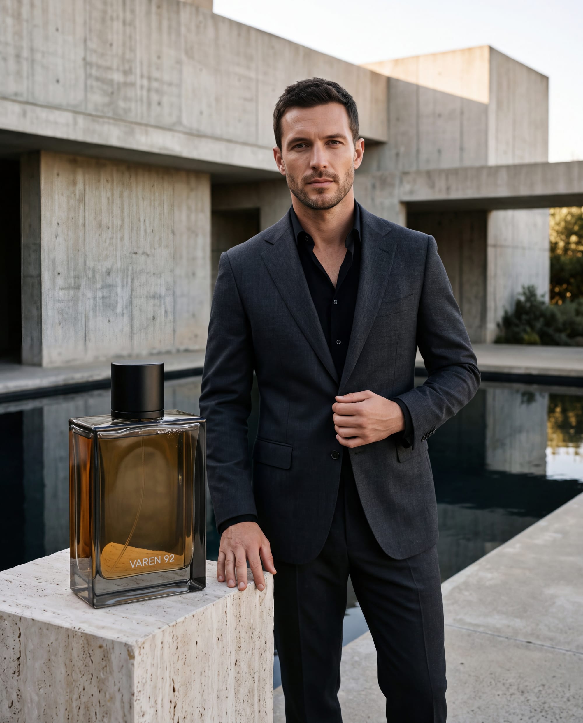
The last brief was a luxury campaign for a fictional fragrance called VAREN 92, in which a 32-year-old man in a charcoal suit stands in a brutalist concrete villa beside a black reflecting pool, both hands visible, in late-afternoon side light. In the foreground, a heavy smoked-glass bottle with real liquid sits on a travertine plinth, printed only with "VAREN 92".
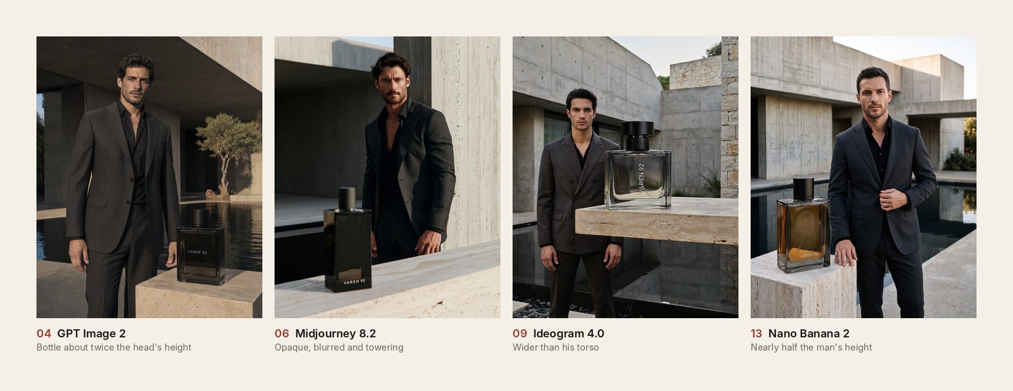
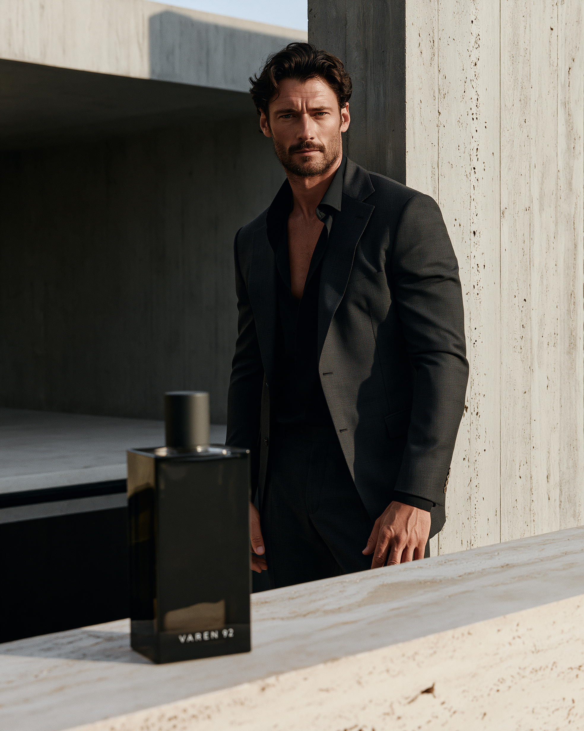
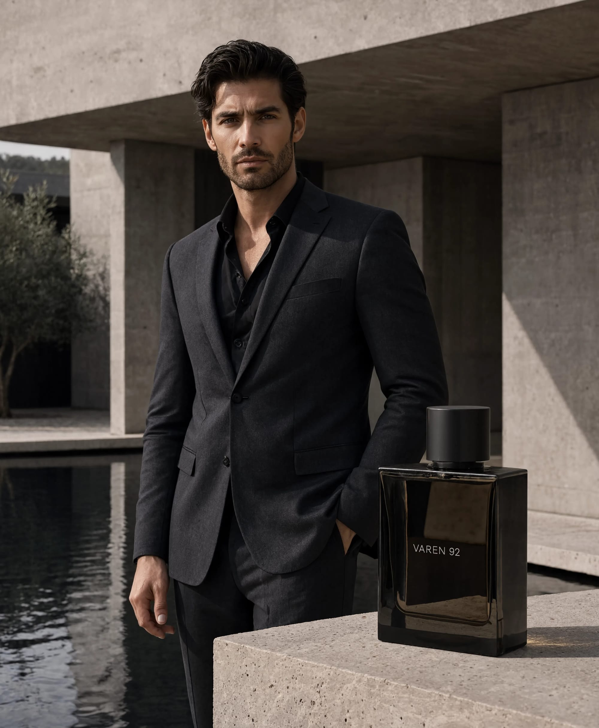
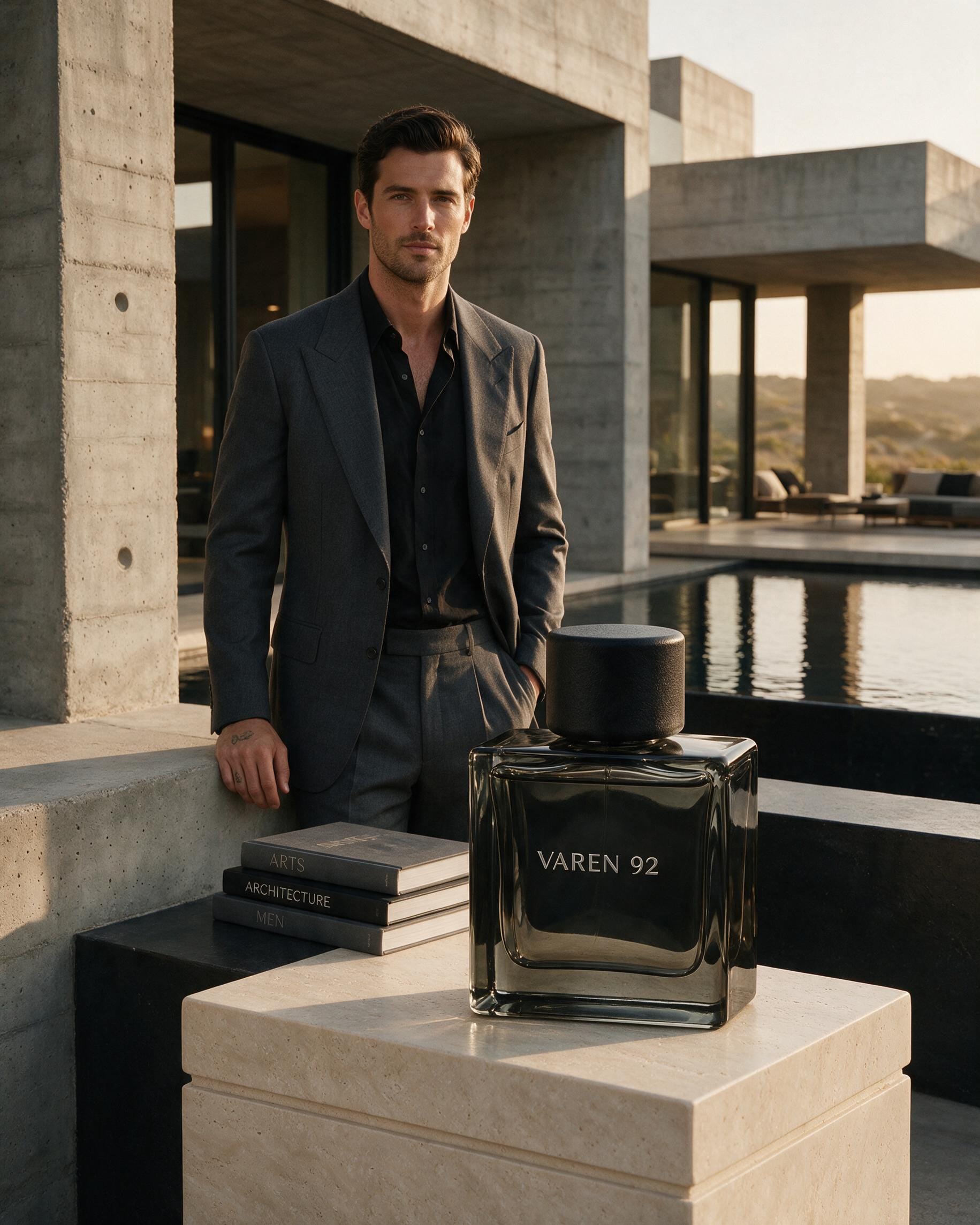
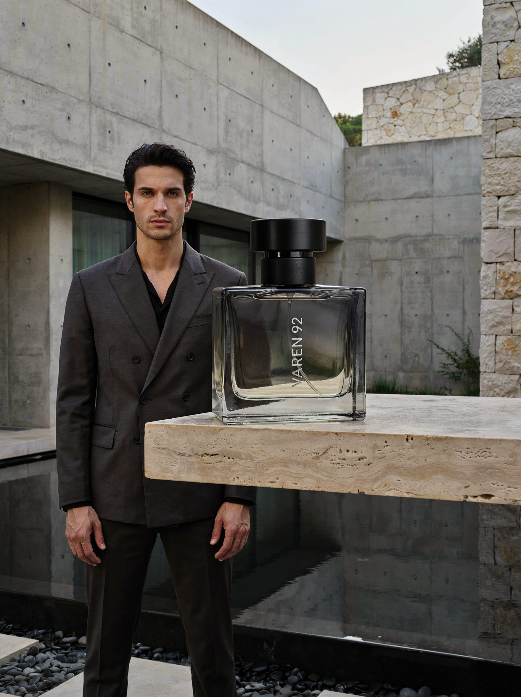
We didn't give the bottle a size, because a human art director wouldn't need telling that a fragrance bottle shouldn't be taller than the model's head, and we wanted to see which models knew that without being told. Every one of them spelled VAREN 92 correctly, and almost every one then made the bottle taller than the man's head. Only MAI put it far enough in front of him for that size to look natural.
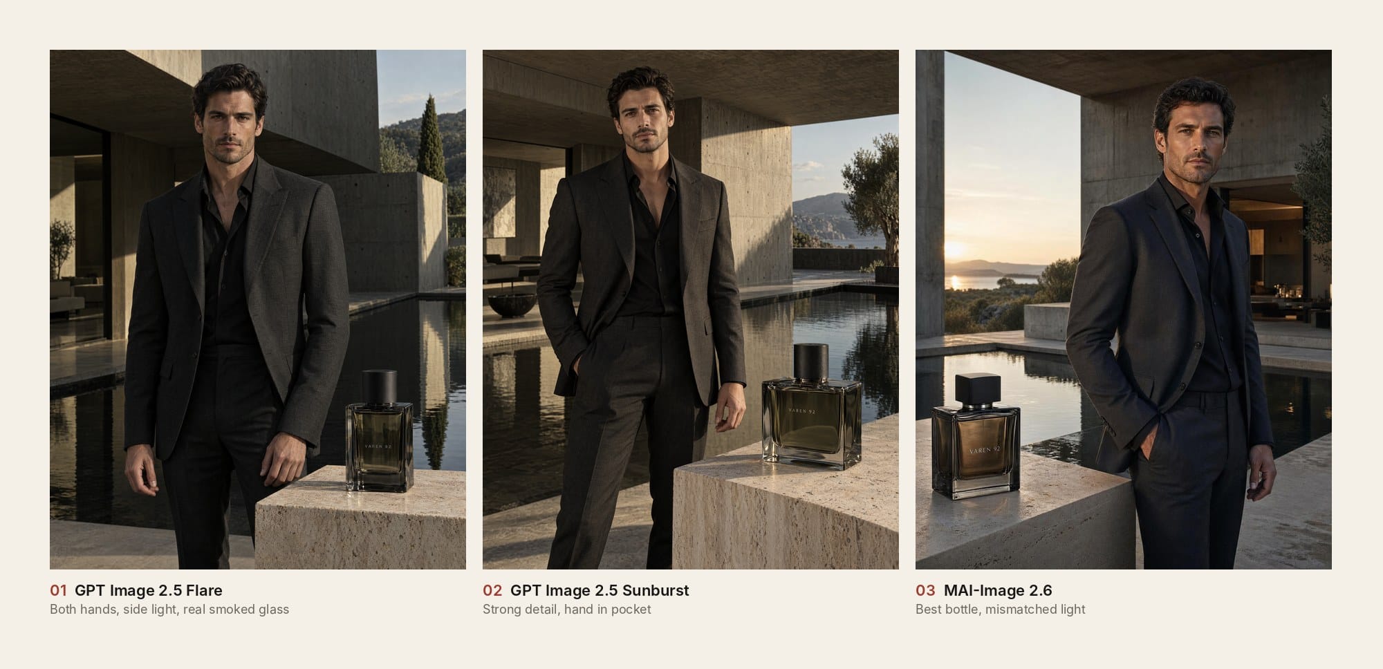
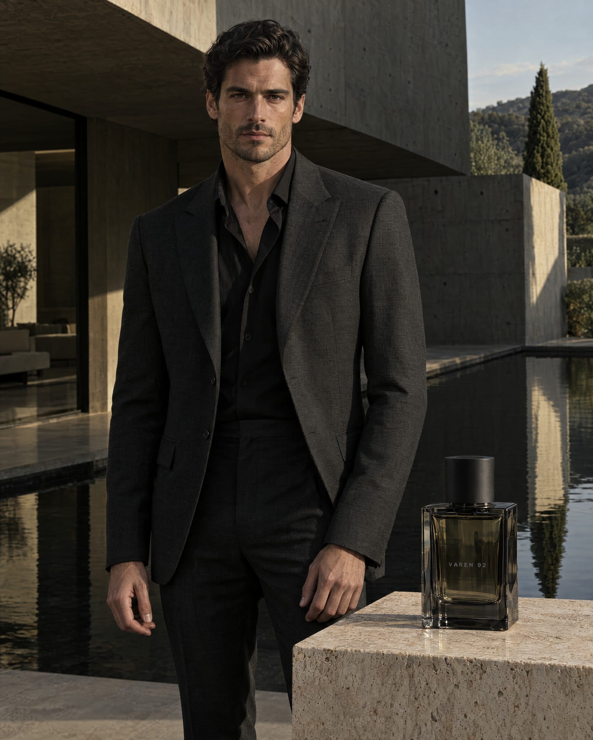
Flare made the image that works best as a real campaign shot. Both hands are there and look natural, the light comes from the side, the bottle stands on travertine, and the glass has real liquid and thick walls. Its man is the best-looking in the test, with natural proportions and a face that holds up at full size, and he and the bottle look like they were photographed on the same day. The bottle is still too big, taller than his head at roughly the same distance from the camera, but after looking at the rest of this round, it's the one you could almost get away with.
Sunburst is second with a strong, detailed image that slips in the places Flare didn't: one hand is in a pocket, the bottle is oversized, and the man and the product sit together less comfortably. Flare's man also just looks better.
MAI-Image 2.6 Preview has the best bottle anyone produced, so It's closer to the camera than the man, so the size reads naturally, and the amber liquid, heavy base and refraction are all convincing. It's third because one of his hands is in his pocket too, and the low sun sits behind him while his face is lit evenly from the front, which is the kind of lighting a real shoot wouldn't give you.
GPT Image 2 nailed the skin, tailoring and light before making a bottle about twice the height of the man's head. Grok came fifth with its best image of the three tests, and with a large bottle that stops short of absurd it finally looked like it belonged in the same test as the others.
Midjourney 8.2 has the best mood of the round, with expensive light, great tailoring and convincing concrete, and the product is where it falls apart: the bottle is an opaque black block with no liquid or glass thickness, it's out of focus despite the ban on artificial bokeh, and it towers over the foreground. As a mood board it's beautiful. As a fragrance advert, the fragrance is the weakest thing in it.
Reve 2.1's campaign is usable and controlled, apart from the same pocketed hand and a bottle on the big side. Seedream 5.0 Pro's bottle is big too, and it added a stack of books with a readable title on the spine, which the no-additional-copy rule was there to prevent. Ideogram 4.0 understood brutalist architecture better than most and then made the most oversized bottle in the test, on a raised plinth beside his head and wider than his torso.
The bottom four went wrong with the man rather than the product. Meta Muse placed him so oddly against the reflecting pool that he appears to be standing in the water. All three Nano Bananas have proportions that distract from the advert: Nano Banana 2.1 has good hands and a convincing setting, but the man's head looks too big for his body, and once you see it you can't stop seeing it, while Nano Banana Pro and Nano Banana 2 made bottles approaching half his height, so the man looks too small for his own advert.
Maybe we're wrong. We haven't checked the fragrance market lately, but we're fairly sure the bottles are supposed to be smaller.
Prompt and settings used for Test 3
Every model received the same fictional brand, person, product and location. We supplied no reference images, so the composition, bottle scale and visual direction came entirely from the model.
Prompt
Create a luxury European menswear and fragrance campaign for the fictional brand VAREN 92.
A handsome 32-year-old man with dark hair and light stubble stands inside a brutalist concrete villa beside a black reflecting pool. He wears an impeccably tailored charcoal suit over a black open-collar shirt. Show his full upper body and both natural hands. His expression is calm and direct.
In the foreground, place a heavy rectangular smoked-glass fragrance bottle on a pale travertine plinth. It contains realistic liquid and has thick glass, accurate refraction, crisp reflections and a matte black cap. Print only “VAREN 92” on the bottle in small silver lettering.
Use controlled late-afternoon side light and a restrained charcoal, stone and muted-olive palette. The man, bottle and location should look as though they were photographed together. No additional copy, logos, plastic skin, haze, artificial bokeh or watermark.
Settings
We selected the highest practical native quality and a portrait ratio supported by each platform, then kept the first result without editing the bottle, label, person or background. We deliberately gave no exact bottle measurements because recognising the normal scale of a familiar product was part of the test.
How our results compare with Arena
Arena's text-to-image leaderboard is built from blind votes: people see two images made from the same prompt and pick the one they prefer. On 7 October 2026 it had more than 6.6 million votes across 82 models, so it's a good measure of which images people like at a glance across a huge range of prompts. Our test asks something narrower, whether a model delivered three specific briefs, including exact data on a screen and a product at a sensible size.
Arena's top three were Sunburst, Flare and GPT Image 2, with both 2.5 scores still marked preliminary. We also have the two new OpenAI models on top, level on points, but GPT Image 2 drops to fourth with us, behind Midjourney, because its hospital scene was accurate and plain. Most of the other disagreements come from things a quick vote doesn't catch. MAI-Image 2.6 is fifth on Arena and joint ninth with us, because a model that fails a whole test can't climb far on a list like ours. Ideogram 4.0 goes from twentieth there to fifth here on the strength of the hospital screen and a strong portrait, and Seedream 5.0 Pro from twelfth to sixth, largely thanks to that same test. The biggest gap is Grok: its canvas version sits fourth on Arena, while ours finished twelfth, with the advert as its only result we'd call good. Midjourney isn't on Arena at all.
Which AI image generator should you use?
The ranking only covers the first image from three prompts, while choosing a tool also depends on the interface, the editing around it, the filters and how you pay. So here is each model in ranking order: how it did in every round, what we liked, what bothered us and who we'd send to it. Where something comes from separate TGK work rather than these tests, we say so.
GPT Image 2.5 Flare: the best all-rounder for people and products
Joint 1st overall · Face 2nd · Hospital =5th · Advert 1st · $1.00 per 4K max-quality run
OpenAI describes Flare as the model for everyday work and Sunburst as the one for precision, so we went in expecting the cheaper-feeling compromise and didn't get one. Its portrait has individual hair strands, visible pores, convincing eyes and properly drawn ears, and the under-eye skin only looks smoother once Sunburst sits next to it. In the hospital its text stayed exact even where the screen turned away at an angle, and its VAREN 92 campaign was the one image in the round that looked like it came from a real shoot, with both hands, side light, real smoked glass and a man who holds up at full size.
Left to itself, Flare keeps things plain. Its hospital station is clean and accurate, but the dashboard still looks like a render sitting on the monitor rather than a screen lit by the room around it. The bottle in its advert is taller than the man's head, a mistake every model except MAI made, although Flare's is the one you could almost get away with.
We ran it through WaveSpeed at 4K on the max quality tier, which gave us a 2576 × 3216 PNG for $1.00 a run, eleven times what Seedream cost.
What we liked
- The most believable campaign photograph in the test
- Exact screen text, even where the monitor turns away
- Natural people with real hair, skin and ears
- No weak round across the three tests
What bothered us
- $1.00 per 4K max-quality run
- Plain compositions unless you describe the mood yourself
- A hospital dashboard that looks laid onto the monitor
- An oversized bottle, like almost everyone else's
Who benefits most
Flare suits marketers, brand teams and creators who want one model for people, products and layouts and are happy to pay for finished images. It makes less sense for fifty speculative variations, and when atmosphere matters you'll need to give it some direction.
GPT Image 2.5 Sunburst: the most photorealistic face we tested
Joint 1st overall · Face 1st · Hospital =5th · Advert 2nd · $1.00 per 4K max-quality run
Sunburst made the least retouched face in the test, and it took a second look to see it, because the whole image has a grey, slightly faded grade that makes Flare's warmer portrait more flattering at first glance. At full size Sunburst has open pores across the nose and cheeks, skin that creases under the eyes like real skin, uneven freckles, separate eyebrow hairs and faint veins in the whites of the eyes, which is exactly the detail the brief was written to find.
The other two rounds were strong without being special. Its hospital scene has real-looking people and exact text, and the patient bed it put behind the station makes the room feel like a working ward, but the composition is as plain as Flare's. In the advert it made a detailed image and then put one of the man's hands in his pocket after we asked for both, oversized the bottle and balanced him and the product less comfortably than Flare did.
OpenAI pitches Sunburst as the slower precision model, and through WaveSpeed it costs the same $1.00 as Flare for a 4K max-quality run.
What we liked
- The best close-up skin, eyes and hair in the test
- Exact text on the hospital screen
- A patient bed that made the hospital scene feel lived in
- Strong detail in every round
What bothered us
- A grey, faded grade on the portrait
- A hand in a pocket after we asked for both hands
- A plain hospital composition
- The same price as Flare, with slower generation
Who benefits most
Sunburst is the model for any face a client will zoom into, such as a master portrait for a recurring character, a hero image or a skincare visual. If your work is mostly products and scenes, Flare gave us slightly better results for the same money.
Midjourney 8.2: our favourite visual style
3rd overall · Face 4th · Hospital 3rd · Advert 6th · $10 Basic monthly plan
Midjourney still has the clearest aesthetic personality in this group. Its results look as though somebody made an art-direction decision before the generation began, which is why we keep coming back to it for album covers, fashion, campaign concepts, editorial images and the first master portrait of a recurring character.
That taste helped and hurt it here. The portrait has a wet, oily sheen and noticeably bigger lips, which makes a striking beauty shot and not the neutral studio headshot we asked for. The hospital image is the best-looking photograph of the round, with the doctor seen from behind at a teal-lit station, until you zoom in and find "989b" on both the oxygen and NEXT CHECK cards and no 14:30 anywhere. The VAREN 92 campaign has the best mood of the round and the weakest product, an opaque black block with no liquid that's out of focus despite the ban on artificial bokeh.
The website is a big part of the appeal - the creation feed, personalisation profiles, moodboards, style controls and image discovery make it pleasant and supre cool to explore ideas instead of staring at an empty prompt box, V8.2 supports native HD, and Raw mode helped us tone down the house look. We only pay for Midjourney when we need it, and refunds have been painless for us, although the official policy only offers one if the account has used fewer than 20 lifetime GPU minutes.
What we liked
- Our favourite balance of photorealism and visual taste
- The best-looking hospital photograph and the best mood in the advert round
- Excellent fashion, campaign and editorial compositions
- Personalisation, moodboards, Raw mode and style controls on the website
What bothered us
- Wrong numbers on the patient screen, with "989b" where 98% should be
- An opaque, blurred fragrance bottle
- Four images per prompt, which complicates a strict first-image comparison
- The $10 Basic plan gives 200 Fast GPU minutes and no unlimited Relax mode
Who benefits most
Midjourney suits designers, musicians, publishers and marketers who care first about how an image feels. It's our pick for album art, editorial concepts, campaign direction and source portraits, while exact numbers, UI mockups and products that need to be the right size belong elsewhere.
GPT Image 2: still good in ChatGPT, now overtaken by 2.5
4th overall · Face 3rd · Hospital 7th · Advert 4th · $0.72 per 4K High run
GPT Image 2 topped the August version of this test, and OpenAI's two 2.5 models have now beaten it in all three rounds. Its portrait still came third, with great eyebrows, lashes and irises and cheeks that are visibly smoother than either 2.5 result. The hospital screen kept every important word correct and looked neat, which only got it seventh in a round decided by how real the station looked. Its VAREN 92 campaign had excellent skin, tailoring and light, and a bottle about twice the height of the man's head.
The easiest way in is ChatGPT, where you can ask for an image, point at what's wrong and keep going in the same conversation. We got our highest-detail file through WaveSpeed because its controls exposed 4K resolution and High quality directly, and in our comparison the WaveSpeed download kept more close detail than a similar image from ChatGPT. At $0.72 per 4K High run, one excellent source portrait is reasonable, while fifty speculative variations add up quickly. OpenAI's safety filters can also interrupt legitimate swimwear, adult fashion and AI-character work, though Reve and Ideogram were stricter in our separate experiments.
What we liked
- Strong pores, eyes, eyebrows and lashes in the portrait
- Accurate requested text on the hospital screen
- Conversational generation and editing inside ChatGPT
- High-end skin, tailoring and light in the advert
What bothered us
- $0.72 for the 4K High WaveSpeed run
- A bottle about twice the height of the man's head
- A neat but plain hospital scene
- Clearer quality controls through WaveSpeed than in ChatGPT
Who benefits most
GPT Image 2 makes sense for anyone already paying for ChatGPT who would rather talk an image into shape than learn sliders. If you're paying per image through an API, Flare and Sunburst cost more and beat it in every round we ran.
Ideogram 4.0: excellent text and one of our best faces
5th overall · Face 5th · Hospital 2nd · Advert 9th · $0.20 per 2K High run
Ideogram has outgrown the "text model" label that follows it around every comparison page. Its close-up portrait has some of the best eyes in the test and real skin texture underneath, even though it added heavy mascara to a prompt that banned dramatic makeup.
The hospital round was more complicated and more useful. Ideogram read the word "vertical" as an instruction to stand the monitor upright, so we removed the word and ran it again. The rerun added a live patient-camera panel showing a nurse at a bedside, which we never asked for and which made the dashboard feel like part of a working hospital system. It also printed "ORYGEN 98%", repeated the line, turned a button into "UPLSDATED" and dropped the ECG and oxygen chart to make room for the camera feed, which is what kept it behind Seedream.
The advert went the other way. Ideogram understood brutalist architecture better than most models and then made the most oversized bottle in the test, wider than the man's torso. Its official site is now much closer to a complete creative platform, with a feed, generation controls, Canvas and editing tools rather than a single text box.
What we liked
- Excellent eyes and skin in the close-up
- The most inventive hospital screen in the test
- A strong feel for architecture and materials
- A useful official workspace with Canvas and editing tools
What bothered us
- Heavy mascara after we banned dramatic makeup
- A misspelled reading and missing charts on the hospital screen
- It took "vertical" literally until we reworded the prompt
- The most oversized bottle in the advert round
- Restrictive filters for revealing fashion and bikini advertising in separate tests
Who benefits most
Ideogram suits designers making posters, packaging, menus, social graphics, architecture concepts and adverts where the wording has to survive, and it's a serious option for photorealistic source portraits too. Check every word at full size, and describe how big the product should be, because it won't guess well.
Seedream 5.0 Pro: the best value and the best hospital scene
6th overall · Face 10th · Hospital 1st · Advert 8th · $0.09 per 2K run
Seedream won the hardest round in the test on the cheapest paid run we recorded. Its hospital monitor is a touch dimmer and warmer than a fresh render, so it matches the room's exposure, and the window controls and dense layout look like real hospital software, with every requested element present. It filled the tabs and sidebar with half-readable invented labels, which the prompt banned, but nobody else made a workstation that looked this much like a photograph.
ByteDance describes Seedream 5.0 Pro as a model for design, information-heavy layouts and professional production, and that showed on the screen. In our separate fashion and advertising work it has also been the least likely of these models to refuse swimwear, different body types or bolder concepts, although it isn't unfiltered.
The recognisable Seedream classic finish is the catch: faces get a glow, that beauty-filter finish with a faintly CGI edge, which is why its portrait finished tenth even though the cheek shows real pores and uneven redness up close, and in a row of AI images we can usually guess which one is Seedream. Its advert had a big bottle and a stack of books with a readable title on the spine, and in an earlier tennis test it struggled to place a player properly on court, so one great scene doesn't mean it always knows where things go.
What we liked
- The best hospital workstation in the test
- $0.09 per 2K run, the best value here by a distance
- Comfortable with information-heavy layouts
- Fewer refusals for normal fashion and advertising work
What bothered us
- The Seedream glow on faces
- Invented small labels on the screen
- A readable book title in the advert after we banned extra copy
- Spatial placement errors in our other work
Who benefits most
Seedream is the sensible choice for marketers and creators producing lots of adverts, designed scenes and text-heavy images without paying $1.00 a picture. If the brief needs a face nobody can identify as AI at close range, Sunburst, Flare and GPT Image 2 gave us stronger evidence.
Reve 2.1: the best editor and a dependable all-rounder
7th overall · Face 11th · Hospital 4th · Advert 7th · $0.28 per run
Reve's raw images were solid rather than standout. Its hospital scene handled the monitor angle more naturally than most and kept the doctor and screen in one convincing shot, with the core text right and only a few tiny chart labels breaking up at full size. The advert is usable and controlled, apart from a pocketed hand and a bottle on the big side. The portrait is where it lost ground, with good eyes and glowing skin but black hair after we asked for dark blonde, and less fine detail than the leaders.
The official Reve interface makes a stronger argument than the three images do. Its Annotate Anything editor has three tools: Spotlight marks a region to change, Draw turns a rough sketch into a described object, and Select snaps to an existing object so you can move, resize, replace or remove it. You can also drop in specific objects as a collage. For interiors, product mockups and adverts, pointing at the exact spot is far easier than writing another paragraph and hoping the model understands "the lamp on the left, but not that other lamp."
The site is clean and easy to understand, especially next to platforms that hide useful controls behind technical language. Our separate attempt to use face and body references for bikini advertising ran into strict filters, though, so it won't replace Nano Banana Pro or Seedream for our recurring-character work.
What we liked
- A natural monitor angle and a convincing hospital scene
- A usable, controlled advert
- Spotlight, Draw, Select and collage editing on the official site
- Particularly good for interiors, product mockups and ad layouts
What bothered us
- Black hair in the portrait after we asked for dark blonde
- A pocketed hand and a big bottle in the advert
- Strict filters in our bikini and adult-fashion reference test
- $0.28 per WaveSpeed run, three times Seedream's price
Who benefits most
Reve is a strong choice for interior designers, property marketers, graphic designers and ad teams who want to mark changes directly on the image. It's also good for UGC-style concepts and product scenes, as long as the campaign stays inside its filters. If all you want is the most detailed human face, spend the money elsewhere.
Nano Banana 2.1: Google's best result in this test
8th overall · Face 7th · Hospital 9th · Advert 11th · $0.135 per 4K run
Nano Banana 2.1 is Google's update to Nano Banana 2, its Flash-tier model, and it finished ahead of both older Nano Bananas. Its portrait was the largest file in the test at 3712 × 4608, and although the skin is still on the smooth side, the face is cleaner and more convincing than Nano Banana Pro's. In the hospital it got strong perspective and exact text, but the interface sits on the screen like a separate layer, something we've seen from Google's models before, and the doctor has the same lifeless look as everyone below GPT Image 2. The advert has good hands and a convincing setting, and a man whose head looks too big for his body.
We ran it through WaveSpeed at 4K with Web Search and Image Search off, and it cost $0.135 a run, a fraction under the $0.14 Nano Banana 2 cost in August.
What we liked
- Cleaner skin than Nano Banana Pro and Nano Banana 2
- Exact screen text with strong perspective
- Good hands and a convincing setting in the advert
- Slightly cheaper than Nano Banana 2 at 4K
What bothered us
- Skin that's still on the smooth side
- An interface that looks layered onto the monitor
- A head too big for the body in the advert
- A lifeless doctor in the hospital scene
Who benefits most
Nano Banana 2.1 suits people working in Google's tools who want a fast, cheap model for everyday images and edits. Treat it as Google's quick option rather than a rival to Sunburst or Flare on faces, and for recurring characters built from several references we'd still use Pro.
Nano Banana Pro: still our choice for recurring characters
Joint 9th overall · Face 8th · Hospital 8th · Advert 12th · $0.24 per 4K run
Nano Banana Pro looked ordinary in this text-to-image test, and it's still one of the models we use most, because we choose it for reference handling rather than a blind first prompt. When we build a recurring character, we give it a face, body and scene reference, ask for a new composition and keep changing the same image while the identity holds. Google says Nano Banana Pro can blend up to 14 input images and keep up to five people consistent, which is much closer to our advertising workflow than three clean prompts. Our Nano Banana consistent-character guide and Nano Banana prompting guide show that process.
Its portrait was attractive and detailed, but Nano Banana 2.1 made a cleaner face and the leaders were well ahead. In the hospital its doctor was the least lifeless of the lower group and the station had some depth, which put it eighth, although it painted a faint hand into the monitor as if a reflection had become part of the interface. The advert's bottle approaches half the man's height. In our experience Pro is still better than Nano Banana 2 for high-quality photorealistic reference work, but that advantage barely showed in this test.
WaveSpeed showed $0.24 for a 4K PNG run, well below the $1.00 for Flare and Sunburst and $0.10 more than Nano Banana 2 at the same resolution.
What we liked
- Excellent identity preservation across several reference images
- Good repeated editing that keeps the same person and scene
- The least lifeless doctor among the lower half of the hospital round
- Practical filters for normal character and advertising work
What bothered us
- An average first image next to the newer rivals
- A faint hand painted into the hospital monitor
- A giant fragrance bottle
- A dry, electric skin finish in some results
Who benefits most
Nano Banana Pro remains our recommendation for recurring AI characters, reference-heavy advertising, brand consistency and campaigns where the same person has to survive many scenes. If you're generating one image from one prompt, the models above it are stronger.
MAI-Image 2.6 Preview: the best bottle and the worst reliability
Joint 9th overall · Face 12th · Hospital no image · Advert 3rd · Free during the preview
MAI-Image 2.6 gave us the most contradictory set of results. Its face was generic, its hospital scene never arrived, and its VAREN 92 advert has the best bottle anyone produced. It's closer to the camera than the man, so the size reads naturally, and the amber liquid, heavy base and refraction are all convincing. It placed third in that round because one of his hands is in his pocket and the low sun sits behind him while his face is lit evenly from the front.
Microsoft launched MAI-Image 2.6 as a limited preview in MAI Playground, with Microsoft Foundry access still private when we tested it. The company highlights text rendering and product, branding and commercial design, and our advert backs up the commercial part, while the missing hospital scene means we couldn't check the text claim ourselves. We tried that prompt roughly ten times, and there's no reason to hide the failure because the model is new. A preview can improve quickly, but anyone choosing a tool today still needs a backup.
What we liked
- The best fragrance bottle in the test
- Professional product placement and campaign styling
- Free access in MAI Playground during our test
- A promising direction for product and branding work
What bothered us
- No hospital image after roughly ten attempts
- An ordinary face next to the leaders
- A pocketed hand and mismatched light in the advert
- No manual quality controls in our test
Who benefits most
MAI is worth trying for product campaigns, branded graphics and commercial concepts while the preview is free. It's too early to build a workflow around it, so keep Flare, Midjourney or Seedream ready when a deadline matters.
Meta Muse Image: far better facial detail than we expected
Joint 9th overall · Face 6th · Hospital 12th · Advert 10th · Free in Meta AI
We're not heavy Meta users, so Muse got no loyalty from us, and its close-up face changed our mood quickly. Working at 1408 × 1760, it produced pores, peach fuzz and fine upper-lip hair convincing enough to beat every Nano Banana.
Outside the portrait it fell apart. The hospital scene got every line of text right and then gave us the same default AI doctor as Grok, with a rigid side profile and a blank stare, in front of a dashboard pasted across the monitor with an oversized header and a desk full of props. In the advert the image quality is good, but the man is placed so oddly against the reflecting pool that he appears to be standing in the water, and the bottle is too large.
Muse is free inside Meta AI and comes with presets, photo combination and sketch-based changes. That's convenient if you already live in Meta's apps, and less appealing if opening one is something you avoid.
What we liked
- Excellent skin detail, peach fuzz and natural facial texture
- A much stronger portrait than its modest reputation suggests
- Every line of the hospital text correct
- Free, with sketch editing and photo combination inside Meta AI
What bothered us
- A stock-character doctor and a pasted-on dashboard
- A man who seems to stand in the pool
- An oversized bottle
- Meta AI is the main way in
Who benefits most
Muse is good for casual creators and social teams already using Meta who want strong faces and quick edits without another subscription. For complete commercial scenes, the models in the top half of our ranking gave us far better evidence.
Grok Imagine Image 2.0: excellent controls, ordinary images
12th overall · Face 13th · Hospital 11th · Advert 5th · Included in the Grok subscription we used
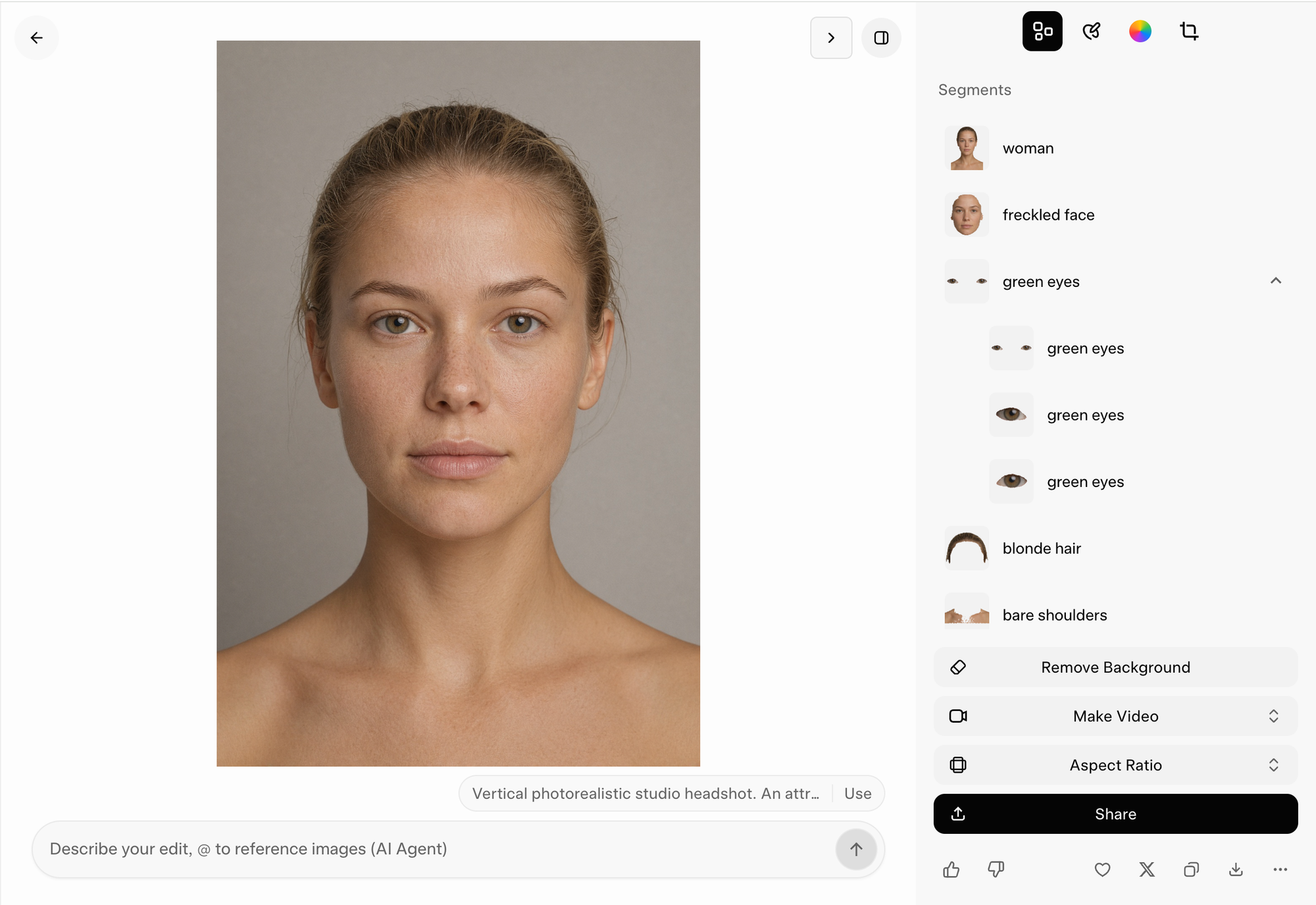
Grok's interface impressed us more than any image it made. The portrait had decent eyes and lips under an obvious applied grain that finished it last in that round. The hospital scene gave us the same default AI doctor as Muse, staring at a screen that faces the camera almost flat, and a star logo beside NORTHSTAR MEDICAL after we banned fake logos. The advert was its best image by a distance, with a realistic man, a polished setting and a bottle that's large without reaching Nano Banana levels, and it placed fifth.
The editing controls are the real surprise. Grok can detect objects, select parts of an image and keep editing in a practical interface, and Imagine Image 2.0 also supports generation and editing through the xAI API, where official pricing starts at $0.04 per image depending on resolution.
What we liked
- Object selection and editing controls better than we expected
- A fifth-place advert with a realistic man and setting
- A low official API entry price
- Quality mode included in the subscription we used
What bothered us
- Applied grain over the portrait's skin
- A stock-character doctor and a logo we'd banned
- No round won and only one result we'd use
- Raw images that don't live up to the interface
Who benefits most
Grok suits somebody who wants one place to generate an image, select an object and change it without learning a specialist design tool. It's fine for quick social content and simple marketing, while anything a client will look at closely deserves one of the leaders.
Nano Banana 2: the cheap 4K workhorse for fast edits
13th overall · Face 9th · Hospital 10th · Advert 13th · $0.14 per 4K run
Nano Banana 2 combines much of Google's image work with the speed of a Flash model, which makes it useful when you already have an image and want to keep adjusting the clothing, pose, background or small objects without waiting or paying for Pro each time. Google positions it around subject consistency, fast edits, world knowledge and production at scale, and that matches our experience better than calling it a photorealism model.
It finished last here. The face was good but behind Nano Banana 2.1 and Pro, the hospital screen invented a second reading, "OXYGEN 16%", which turns a plain screen into a wrong one, and the advert's bottle approaches half the man's height. In a first-image text-to-image test that puts it at the bottom, while in a fast editing comparison it would probably move much higher.
WaveSpeed showed $0.14 for a 4K PNG run, with Web Search and Image Search available in the panel and switched off for our run. That was the cheapest 4K price in August, and Nano Banana 2.1 now does the same job better for slightly less.
What we liked
- Fast repeated edits with good subject consistency
- Useful for high-volume reference and iteration work
- Easy access across Google's products and third-party platforms
- Practical filters for ordinary fashion and advertising prompts
What bothered us
- A wrong "OXYGEN 16%" reading on the patient screen
- An oversized bottle and distracting proportions in the advert
- Less close-up facial detail than the leaders
- Nano Banana 2.1 is now better and slightly cheaper
Who benefits most
Nano Banana 2 suits creators who already have a source image and want many quick, controlled variations, although we'd try Nano Banana 2.1 first now. For one expensive hero portrait choose Sunburst or Flare, and for a recurring character with several references, Pro.
Final verdict
OpenAI’s two new models finished level at the top, and the easiest way to choose between them is to think about what you make most often: Sunburst gave us the most convincing face in the test, while Flare made the campaign photograph that looked most like a real shoot, so people work leans one way and product work leans the other. Neither comes cheap at $1.00 a run, which is why, for most budgets, we’d start with Seedream 5.0 Pro, the model that won the hospital test for $0.09, and simply take a closer look at its small print before anything goes out. And because a first-image test can only tell you so much about a tool, we’d still go to Midjourney when we need a visual direction, to Reve when an edit has to land in exactly the right spot, and to Nano Banana Pro when the same character has to carry a whole campaign.
If editing matters more to you than the first image, our seven-model AI image editing test covers that side of the work directly, and if the finished image needs to move, our AI image-to-video comparison puts Seedance, Kling, Veo and Wan through the same source material.
Questions people ask
What is an AI image generator, and how is it different from an AI image editor?
A generator creates a new picture from a written prompt, a reference image or both. An editor changes a picture you already have, for example by swapping an object or keeping the same person in a new scene. Most tools do both, but rarely equally well, which is why our AI image editing test ranks them differently.
What's the best free AI image generator?
Two models were free when we tested them. Meta Muse Image, inside Meta AI, made a portrait that beat every Nano Banana, but its hospital doctor looked like a stock NPC and its advert put the man in the pool. MAI-Image 2.6, a limited preview, made the best bottle in the advert test but never produced the hospital scene. Free access can change, especially for previews.
Will a better prompt fix these mistakes?
Some of them. Ideogram's upright monitor disappeared once we removed the word "vertical", and giving the bottle a size would probably help with scale, although we haven't tested that. Wrong numbers are harder: Midjourney printed "989b" even though the prompt spelled out "OXYGEN 98%". Our Nano Banana prompting guide shows which extra instructions helped in practice.
Can I trust an AI image generator with prices, logos or other exact text?
Not without checking. Every model spelled VAREN 92 correctly, but three of the twelve hospital screens got requested text wrong, and two of those mistakes were numbers. Check every character at full size, or add important text such as prices yourself in a design tool.
Is a subscription cheaper than paying per image?
It depends on how many images you keep. In our test, single runs cost from $0.09 with Seedream to $1.00 with Flare and Sunburst, so ten Flare runs cost the same as a month of Midjourney Basic at $10. Count the images you end up using: one good $1.00 image is cheaper than six $0.20 attempts you have to fix.
How should I test an image generator before paying for it?
Run three of your own prompts: one image you make often, one with exact text or several objects, and one edit of a real photo. Keep the first result, count the retries and check the downloaded file at full size. Company galleries show a model's best day, and your first results show a normal one.
Can I use these images commercially, and do I own them?
It depends on the provider, and we only checked two. OpenAI's terms say you own what you generate, as far as the law allows. Midjourney allows commercial use on paid plans, but companies earning over $1 million a year need its Pro or Mega plan. Owning an image isn't the same as holding copyright, either: in the US, an image made from prompts alone generally can't be copyrighted. Check each tool's terms, and get legal advice if the stakes are high.
Do AI-generated images carry a watermark?
Not always a visible one. Google says Nano Banana images include an invisible SynthID watermark, and some newer images also carry C2PA Content Credentials in the file data. If proof of origin matters, check the file's metadata and the platform's terms.
Sources
- OpenAI: Introducing ChatGPT Images 2.5, GPT Image 2.5 Flare and Sunburst
- OpenAI: API pricing for GPT Image 2 and GPT Image 2.5
- OpenAI: GPT Image 2 model
- Google: Gemini Nano Banana 2.1 model page
- Google: Nano Banana 2
- Google: Nano Banana Pro
- Midjourney: V8.2 versions and HD settings
- Midjourney: plans and GPU allowances
- Ideogram: 4.0 model page and API pricing
- ByteDance: Seedream 5.0 Pro
- Reve: Annotate Anything
- Microsoft: MAI-Image 2.6 launch and access
- Meta: Muse Image announcement
- xAI: Grok Imagine Image 2.0
- Arena: text-to-image leaderboard (checked 7 October 2026)
- Zapier: best AI image generators
- OpenAI: Terms of Use (effective 1 January 2026)
- US Copyright Office: Copyright and Artificial Intelligence, Part 2: Copyrightability
- TGK: AI Image Generators 2026 dataset on Hugging Face
Explore the complete test data
Open the structured findings, recorded prices, settings, failures and image evidence behind this comparison.
Loading verified test data…